Pearson
UX Framework
A design system that empowers teams to build better products, faster

Pearson
A design system that empowers teams to build better products, faster
Updated on Apr. 24, 2018
Start working in Sketch with ready-made UI components such as colors, buttons, and more! To see how a component works and behaves, please refer to the usage guidelines on this site.
Download UI Kit v1.9.0Just grab the code and you're ready to go! Build apps faster using our premade elements.
Go to npm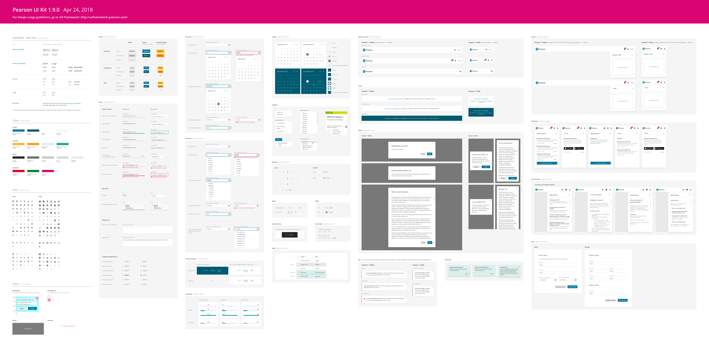
| UXF Design Team | uxf-design@pearson.com OR Slack Channel:#uxframework |
|---|---|
| UXF Development Team | uxf-development@pearson.com OR HiptChat: UXF Help (PDA) |
| UXF Accessibility | HipChat: Accessibility Help |
| UXF Discussion | Go to Discussion |