Design Principles
Design Principles
Dec 15, 2017
Design Principles are critical. They align us as a team, help articulate the fundamental goals that all decisions can be measured against, and keep the various teams moving as an integrated whole. Learn more about how we defined the principles.
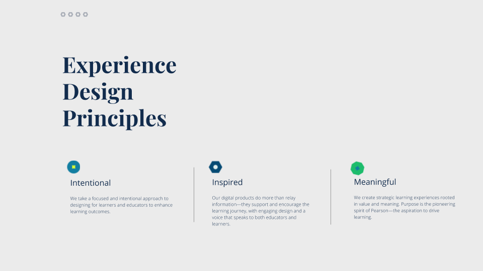
Intentional
-
Make it simple
Help learners focus by providing context and limiting distractions. Simplicity is key—it is critical to realize what’s essential. Most of the time, the best way to understand what’s really important to the learning experience is to get rid of everything that isn’t.
Example: Let the most important elements to a user’s primary task be the focus. Everything else is secondary. -
Make it easy
A clumsy experience makes learning harder. Design the UI so it feels as quick and instinctive as our learners are. Be obvious and not ambiguous. Language and patterns should be intuitive, timely, predictable, uncomplicated, and precise.
Example: The next step should always be clear. Allow the user to resume their activity without restarting—including when they stop mid-exercise. -
Guide me
Help guide users through the experience by providing clear and intuitive interaction, context and next steps.
Example: Create clear way-finding so users understand where they are in the experience.
Inspired
-
Get me started
As the saying goes, you only get one chance to make a first impression—so make it count. Onboarding (to a product, to a purchase, to a learning sequence) sets expectations for the relationship.
Example: From the first moment a user is invited to a course, to the time they engage with the content, the experience should be logical, clear, frictionless and welcoming. -
Help me discover
Find the special opportunities to entice our users into discovery by injecting serendipity through messaging, animation, and other delightful surprises.
Example: UI elements such as toasts, rollover states, and refresh functionality aid in discovery. -
Empower me
Uplift and motivate users when they take a wrong turn or feel like things aren’t working the way they should. Surprise them with moments of accomplishment.
Example: The tone of Pearson messaging should be uplifting and encouraging.
Meaningful
-
Listen to me
Lead with user insights. A solid understanding of user needs and learning objectives should guide design decisions.
Example: Validating a specific function or feature through research and testing. -
Include me
Consider and accommodate the diversity of our learners. Look beyond the idea of an average learner in a typical setting. Design by default for accessibility and inclusivity at all ages, stages and level of capability.
Example: Supporting the ability to access Pearson anywhere, anytime, by anyone. -
Build trust with me
Consistency and patterns help users make sense of the experience, building their familiarity and trust over time. Once established, follow standards, guidelines, and best practices. But keep an eye out for situations that sometimes call for breaking a rule.
Example: Don’t conform to trends and gimmicks - do what feels right for the brand and the user.
See the presentation: