Application Header
Search the component library

Application Header

v2.0.0

This component contains and displays global tools and navigation across the next gen platform.

Usage Guidelines

Every application that’s a part of the next gen platform should display the relevant mode of this header in order to promote a consistent experience.

Features

  • Pearson branding/navigate to home
  • Standard help link
  • Sign in/Sign out
  • My Account
  • Notification access
  • Accessibility best practices
  • Mobile ready responsive design

Signed Out Mode

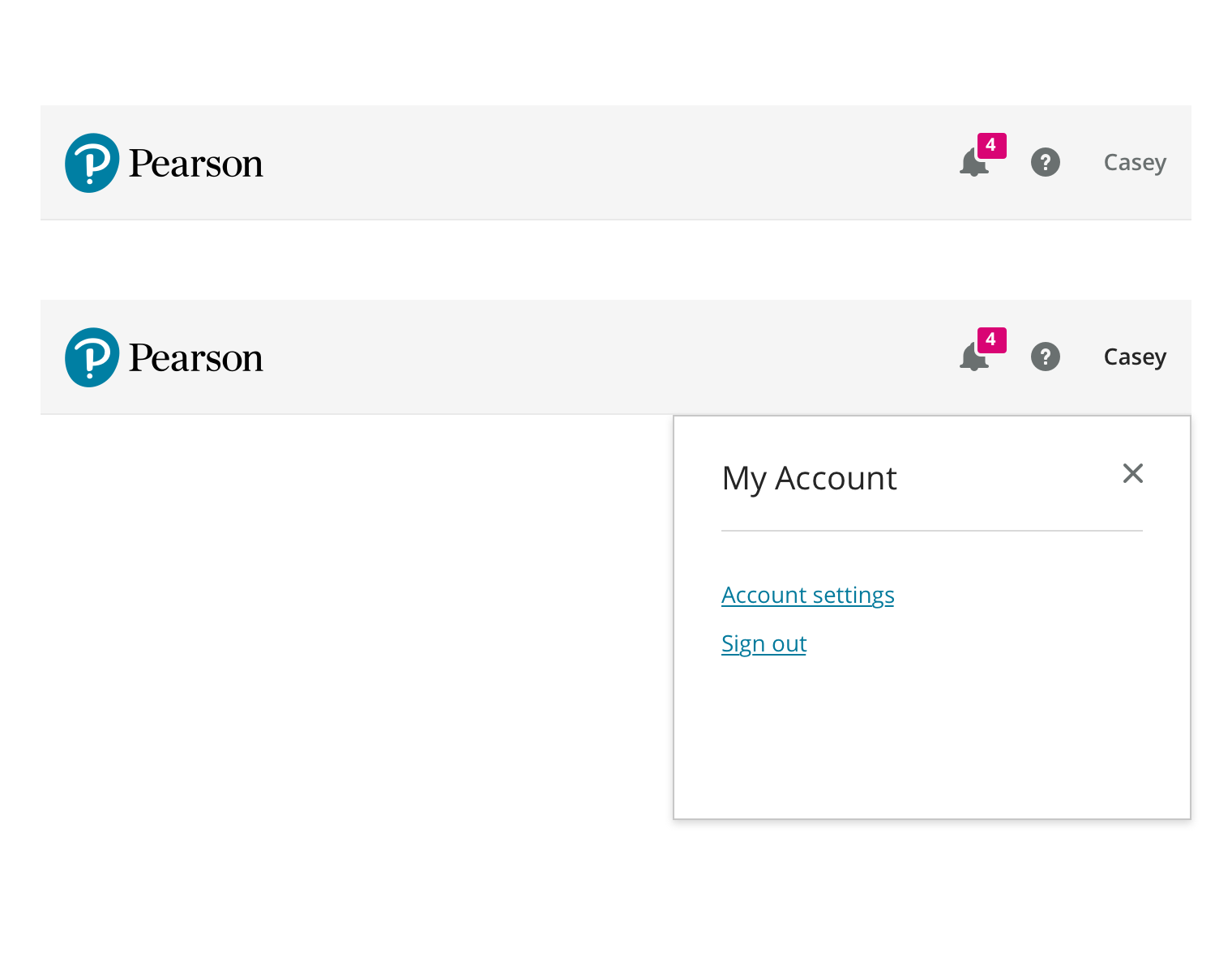
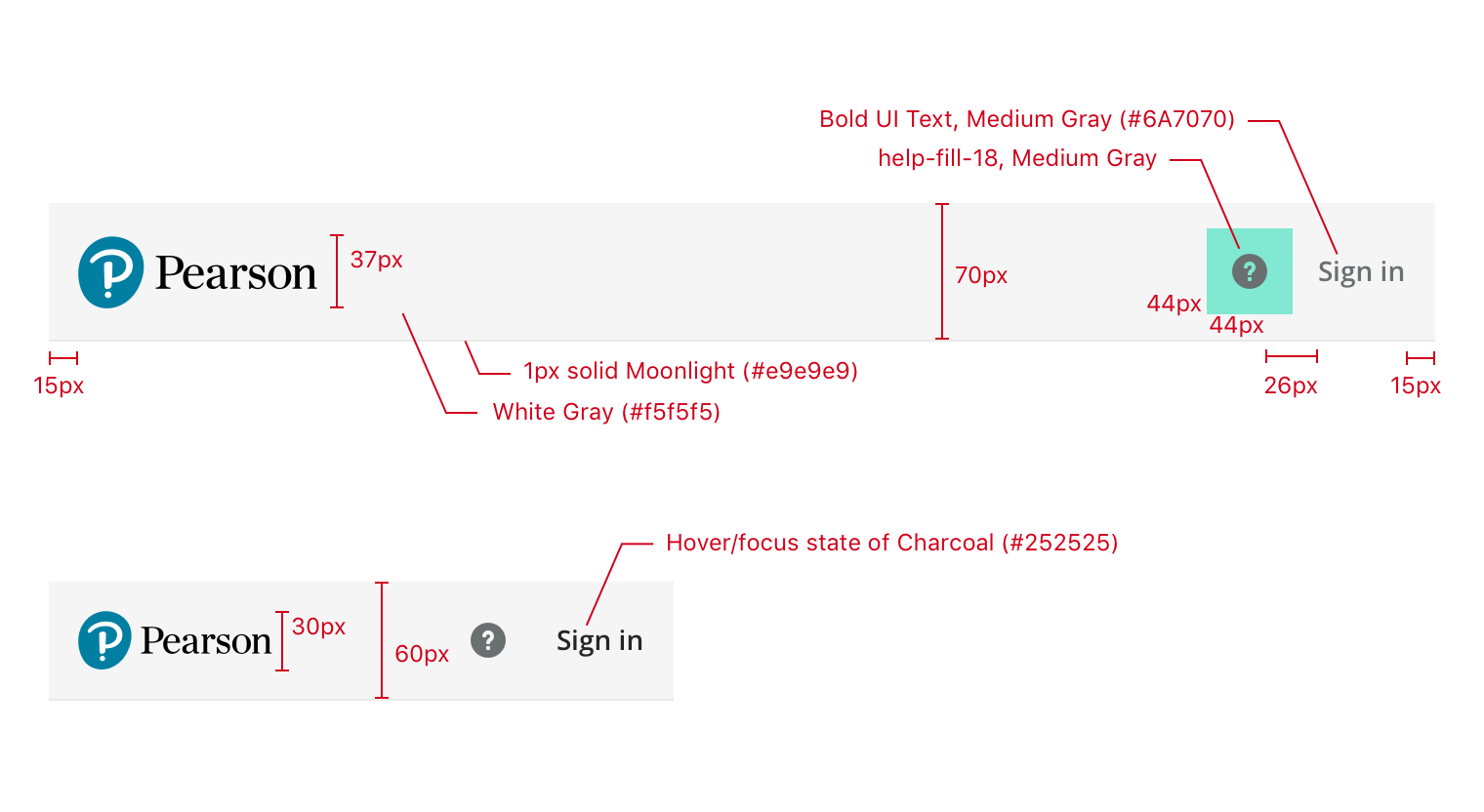
This is the simplest version of the header, just displaying the Pearson logo (with no link interaction), the help icon, and a Sign In link. The help icon is designed to trigger the Contextual Help component.

Use this mode when the user is signed out.

The signed out header has one style that works for every breakpoint.

Basic Mode

Represents the default signed in experience. Expands on the Signed Out Mode by making the Pearson Logo a home link (currently www.console.pearson.com) and including the User Menu.

The User Menu is labelled with the user’s first name and contains Account Settings and Sign Out options. At widths less than 768px the user’s name is replaced with a profile icon.

Use this mode when the user logs in to a standard Pi session and needs a default header experience.

The desktop version of the basic mode header. (Note: Normally the mobile view would be used at this width, it has been compressed for illustration purposes.)

Mobile version of the header is slightly shorter.

Integration Mode

In this version of the header many options are removed that aren’t relevant in cases where a user is linking their account to a 3rd party (e.g. BlackBoard, Canvas, or other LMSs). The Logo is no longer a link and the right side of the header only contains a help link.

Use this mode when the user’s session is managed by a third party and the user shouldn’t have access to platform session features (e.g. sign out, My Account). Specifically, this applies to 3PL/LMS integration scenarios.

Integration mode

Redlines

Signed Out Mode

Available Styles Reference As (How do I use this?)
Signed Out Mode [](/design/c/application-header/v2.0.0/#rd-signed-out-mode)

≥ 768px (medium and larger viewports)

Logo link
  • No active link
Dimensions
  • 70px tall
  • 100% viewport width
Logo
  • 37px tall, vertically centered
Spacing
  • Logo, links, and icons vertically centered
  • 15px from either end
  • 26px between link/icons
  • Icons get a 44px square tap zone
Background
Typography
States
  • Focusing an icon or link uses the default browser style
  • Hovering or focusing an icon or link changes the color to Charcoal (#252525)

< 768px (Small and Extra Small viewports)

Dimensions
  • 60px tall
Logo
  • 30px tall

Basic Mode

Available Styles Reference As (How do I use this?)
Basic Mode [](/design/c/application-header/v2.0.0/#rd-basic-mode)

≥ 1024px (L and XL viewports)

Spacing and dimensions
  • Follow Signed Out Mode specs
Logo Link
  • www.console.pearson.com
Notifications
  • Uses notification-18 icon
  • Badge dimensions are 16px tall with 6px horizontal padding
  • Active badge is Hot Pink (#DA0474) background with White Small Bold UI Text
  • Inactive Badge is White background with Charcoal text
  • 2px White Gray outer border
Account Menu
  • Opens the standard drawer
  • Links are Basic UI Text with the standard link style
States
  • Same as Signed Out Mode

< 768px (Small and Extra Small viewports)

Profile icon
  • User’s name replaced with profile-18 icon

Redlines for larger viewports

Integration Mode

Identical to signed out mode, without the ‘Sign In’ link.

Available Styles Reference As (How do I use this?)
Integration Mode [](/design/c/application-header/v2.0.0/#rd-integration-mode)

Changelog

2.0.0

  • CHANGED: Adopt rebrand style

1.1.0

  • CHANGED: Use colors component
  • CHANGED: Use typography component
  • ADDED: Details on local nav item truncation
  • ADDED: Details on focus and hover states
  • ADDED: .ai mockup file
  • ADDED: Dependency list and references
  • ADDED: Exported styles

1.0.0

Initial release