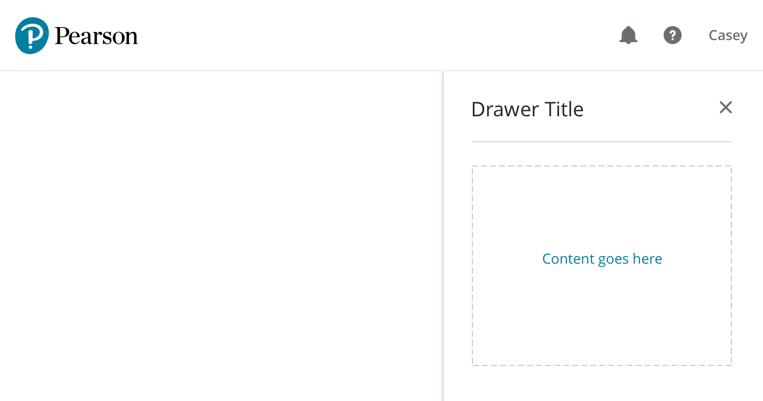
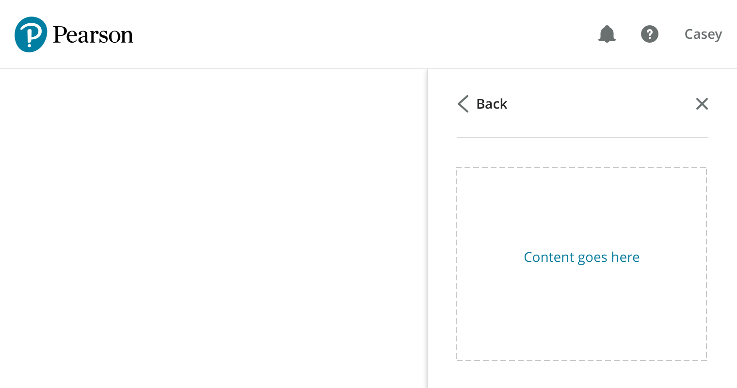
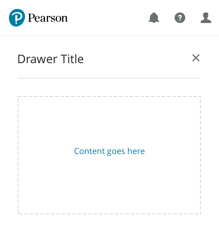
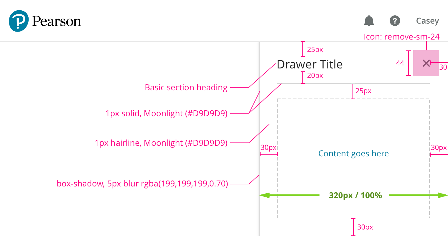
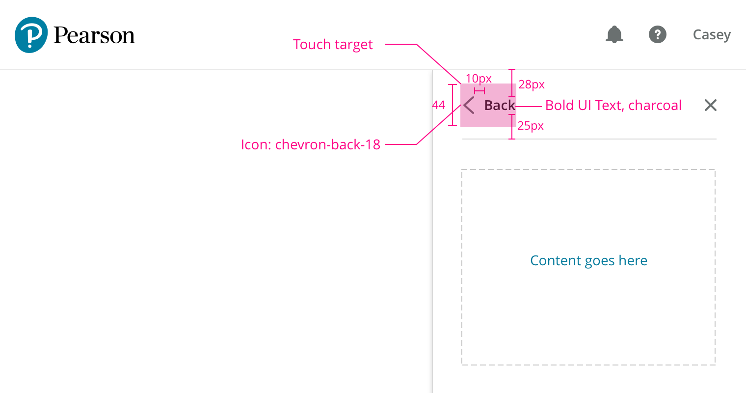
Drawer
Search the component library

Drawer

v2.0.3

The drawer component offers a convenient method for presenting secondary information which doesn't need to be immediately visible.

Usage Guidelines

Drawers should contain secondary content which only needs to be presented when specifically requested by the user, such as help information.

Features

  • Overview and item detail levels
  • Animations for show/hide and viewing item details
  • Accessible implementation

Showing/Hiding

Selecting some UI element on the main page can trigger the drawer to slide in from the right, for example clicking ‘Help’ in the header.

A drawer can be dismissed by clicking the included ‘x’ icon, by selecting the trigger element again, or by hitting the escape key.

Basic View

The basic version of the drawer has a section for a title at the top and a built in close ‘x’ icon.

Content may populate the area below this with 30px margins. Custom background colors and dividing lines may extend to 100% width.

Basic View

Detail View

If the drawer is presenting a list of items, selecting one of them should transition the drawer to the detail view. This adds a back label and icon for returning to the originating view.

The drawer should retain state on close, i.e. closing the drawer on a detail view and then reopening the same drawer will return the user to that detail view.

Detail View

Animation

Displaying the second level uses an animation to provide context.

Responsive Behavior

The drawer maintains the same behavior all the way down to the extra small breakpoint, at which point it begins taking up 100% of the viewport width.

Redlines

Basic View

Spacing
  • 30px side, 25px top and 30px bottom margins around the content area
  • 20px vertical margins below the title area, 30px side margins, 25px top margin
  • Drawer is 320px wide at the Small breakpoint and wider
  • Drawer is 100% width at the Extra Small breakpoint
  • Dividing lines may extend past the content area, up to 100% width
Background
  • Default background is white, may customized to an accessible color and extend to 100% width.
  • Border is 1px solid alto (#D9D9D9)
Typography
Icons
  • Close icon is Remove-sm-24
  • A focused icon will use the standard browser outline for focus
  • Touch target: 44 x 44px
Shadow
  • box-shadow of 5px blur, rgba(199,199,199,0.70) color
Title Separator
Keyboard Shortcuts
  • Pressing escape should close the drawer in any mode
Focus Behavior
  • Opening the drawer moves focus from the triggering element to the first focusable item within the drawer (typically the Close icon).
  • Tabbing within the drawer should cycle through focusable items like normal
  • The drawer should capture focus, so you won’t be able to tab out of the drawer
  • Upon dismissing the drawer focus should be restored to the triggering element

Detail View

Title
  • Use a static “Back” label
  • Focusing the “< Back” element will use the standard browser outline for focus
  • Uses Bold UI Text in Charcoal
Spacing
  • Generally the same spacing as the basic view
  • 28px above the title and 25px below the title (should keep the close icon in the same place)
Icon
Focus Behavior
  • Follow the patterns of the Basic Drawer
  • Transitioning into the detail view should move focus to the first focusable element of the view (typically the back button)
  • Focus should again be captured
  • Focus targets from the Basic View should not be accessible

Show/Hide Transition

Animation
  • Slide in from the right
Timing
  • 0.5 seconds
  • ease-in-out easing

Detail View Transition

Animation
  • Content container slides in from the right
  • Title slides away to the left
  • Back fades/slides in from about the middle of the drawer
Content
  • 0.3 seconds
  • ease-in-out
  • Opacity is 0 in hidden state
Hiding Title
  • Move 40px off to the left
  • Opacity fades to 0
  • 0.3 seconds
  • ease-in-out
Restoring Title
  • Restore properties
  • 0.4 seconds
  • ease-in-out
Showing Back
  • Starts with midpoint centered at 60% of the content width and opacity of 0
  • 0.3 seconds
  • ease-in-out
Hiding Back
  • Reset position and opacity
  • 0.4 seconds
  • ease-in-out

Changelog

2.0.3

Linda Tsai

  • ADDED: Specification for touch target sizes around the BACK arrow and text

2.0.2

Linda Tsai

  • ADDED: Specification for touch target sizes

2.0.1

  • ADDED: Feature links
  • FIXED: Spacing redlines around the title in both views

2.0.0

Apply new brand to existing component.

1.0.0

Initial version.