Grid
Search the component library

Grid

v1.0.1
Download UI Kit v1.9.0

The grid system defines the page layout for aligning elements at different viewport sizes.

Download UI Kit v1.9.0

Usage Guidelines

You should generally not use this component directly, prefer instead to use Templates and Presentation Strategies in your designs.

Features

  • Adapts to standard breakpoints
  • Consistent fluid behavior
  • Handy 12 column grid that can support many layouts
  • Integration with Templates component for easy usage

Dependencies

breakpoints v1.0.0

Grid Structure

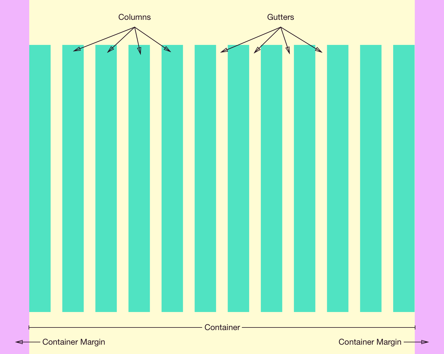
The grid consists of four key parts: the Container, Container Margins, Columns, and Gutters.

All columns reside within the Container, which is located at the root level of a page. Depending on the breakpoint, the container will have Container Margins of various sizes. The container also has a maximum width property, beyond which only the container margins grow in size.

The container is divided into 12 proportional Columns which contain actual content. These are separated by Gutters of a fixed size (which varies based on the breakpoint again).

See the redlines for the exact dimensions of each feature at each breakpoint.

The key parts of the grid.

Redlines

Container
  • Maximum width of 1140px
  • Always horizontally centered
Container Margins
Gutters
Columns
  • Equal widths, size determined by remaining space after accounting for the container width and gutter size
Available Styles Reference As (How do I use this?)
Grid [](/design/c/grid/v1.0.1/#rd-grid)

Changelog

1.0.1

  • ADDED: Added sketch file featuring art boards with grid layout setup for easier consumption.

1.0.0

  • Initial version.