 Inputs
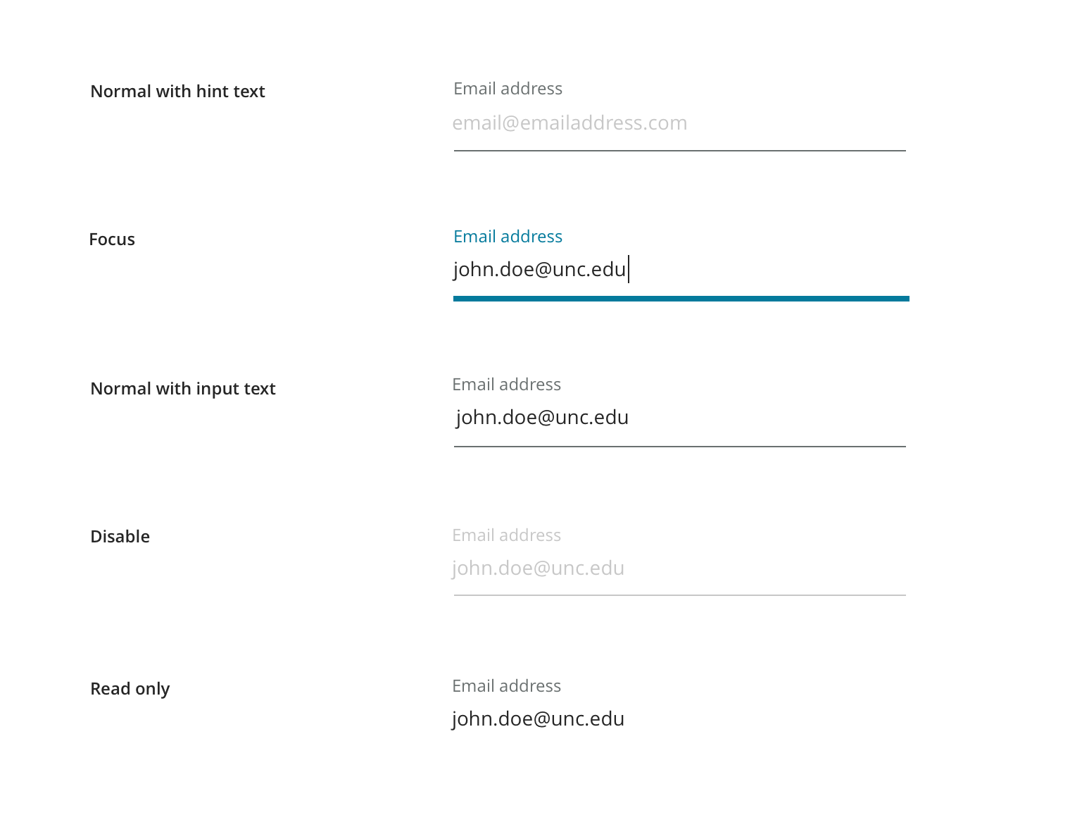
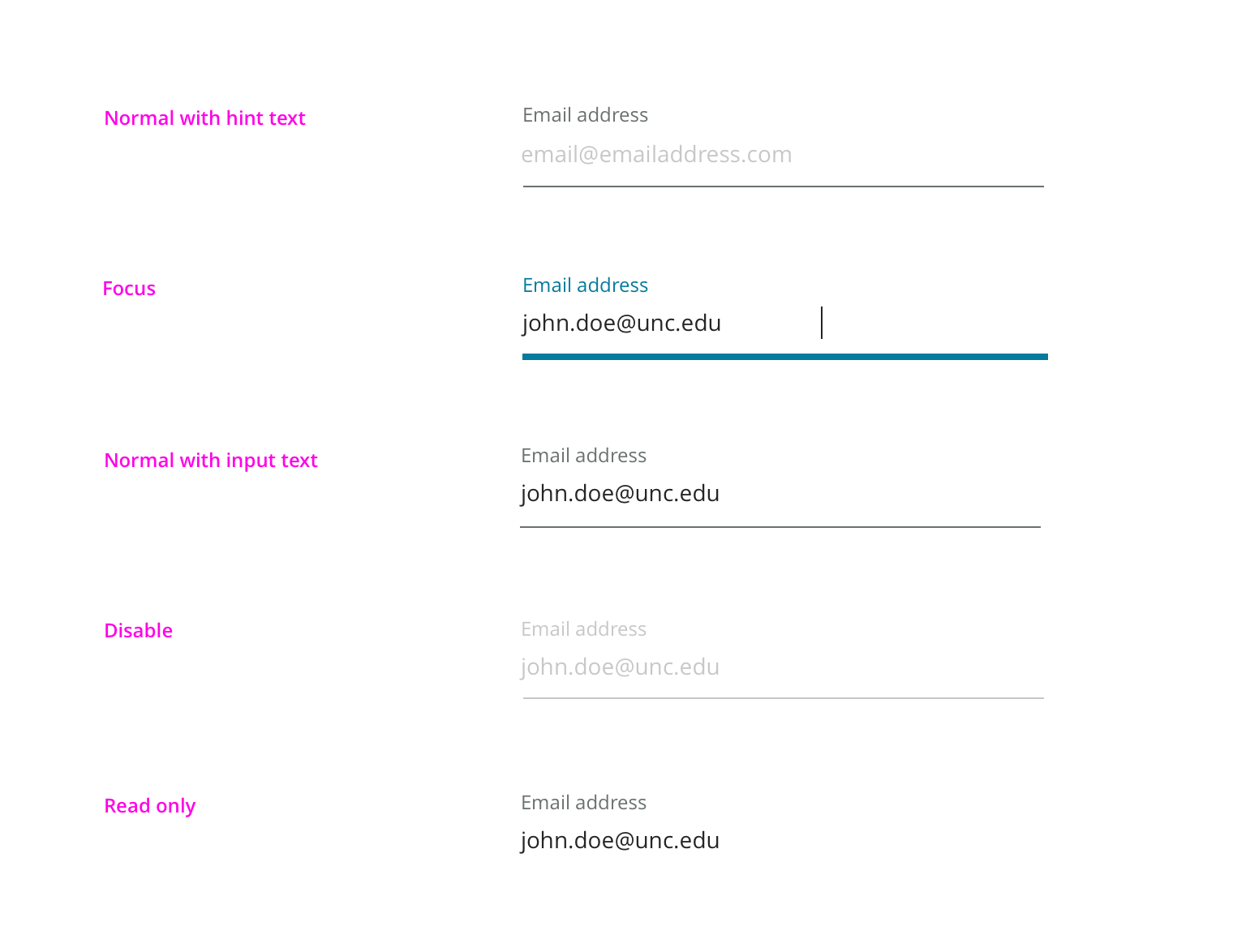
Normal is the normal state of the form element.
Focus is initiated when the user interacts with the field.
Disabled state is a form input that is unavailable for interaction.
Read only indicates that a field is active, but not editable.
This component defines the standard visual style for form elements.
Usage Guidelines
Every instance of a form element should come from this component. See the sections below for information about when to use each type of form.
Features
Normal is the normal state of the form element.
Focus is initiated when the user interacts with the field.
Disabled state is a form input that is unavailable for interaction.
Read only indicates that a field is active, but not editable.
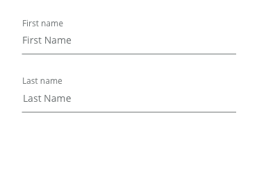
An input is a field used to elicit a response from a user
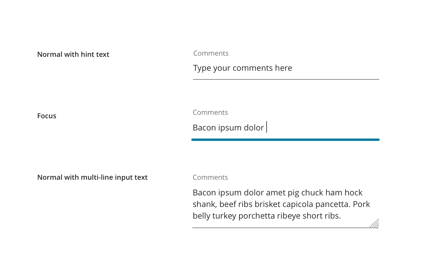
Hint text Usage Hint text should be used as an aid to help guide users on the required format and content.
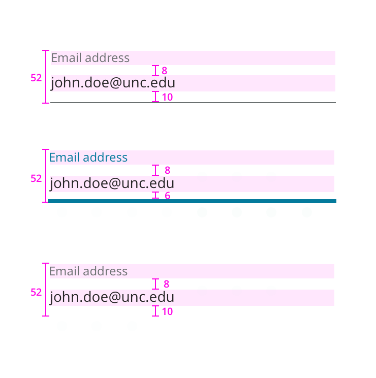
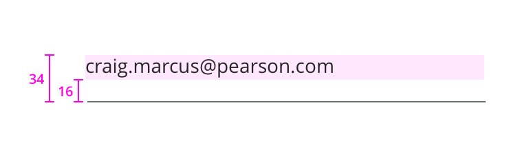
Example of standard inputs
Multiple lines inputs are to be used for multiple lines of text.
The select input allows a user to choose one of many predetermined options.
A default value can be set for the select element if it’s recommended for most users. Bear in mind that a user can easily overlook a preselected item, so use caution when doing so.
The popup will follow the browser default style.
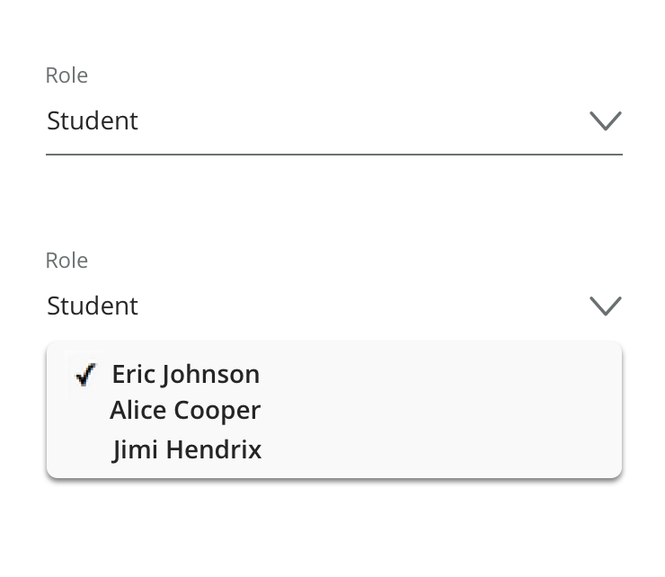
Closed and opened select.
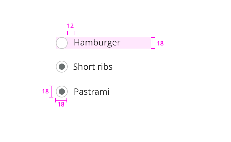
Radio buttons are for when the user must choose a single item out of several options.
Choose radios over selects when you want the user to carefully consider the options and need to expose all available options.
If there are only two mutually exclusive options, consider using a single checkbox. For example, use a checkbox for “I agree” instead of two radio buttons for “I agree” and “I don’t agree.”
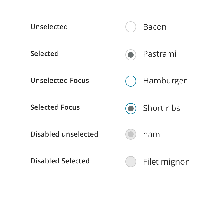
Various radio button states.
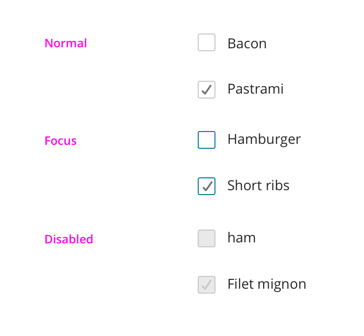
Checkboxes are for times when the user needs to make one or more binary choices about a related item.
Unlike radio buttons, where a group of radio buttons represents a single choice, each check box in a group represents a separate, independent choice.
When there is more than one option but only one can be selected, use a radio button instead.
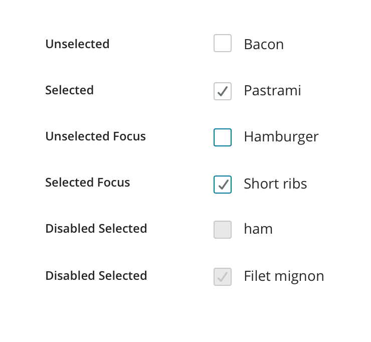
Various checkbox states.
Use the label to indicate whether a given field is required or optional.
Usage Only label in the minority case (for example, if 6 fields are required and 2 are optional, only indicate the optional fields).
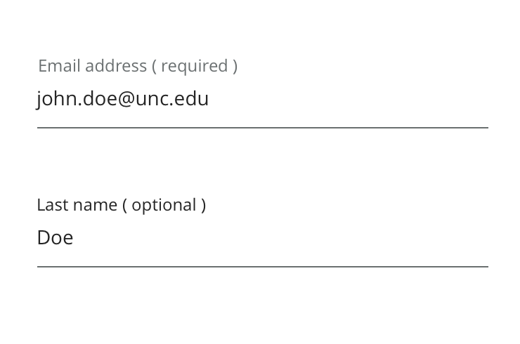
Required and Optional label
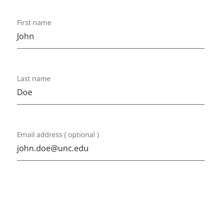
Example using (optional)label in a form
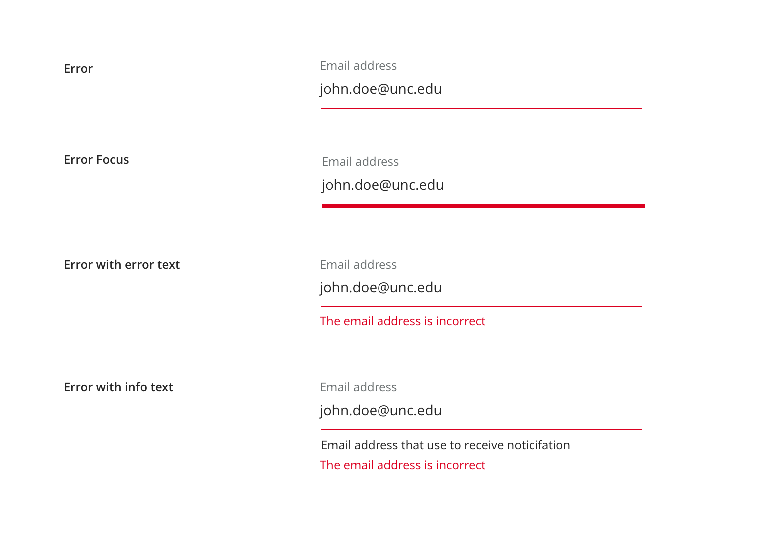
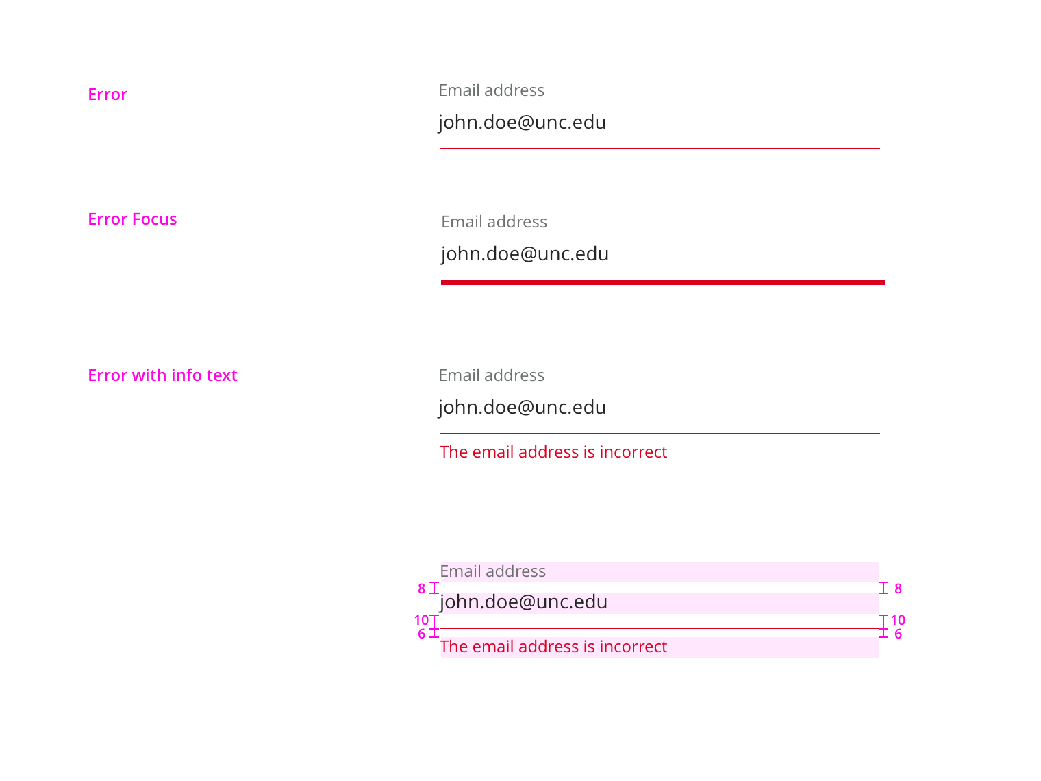
Error is used when a field has been filled out incorrectly. This state should always be paired with an explanatory message.
Focused Error appears when the user focuses an input with an error.
Error with error text Error text displayed when error occur
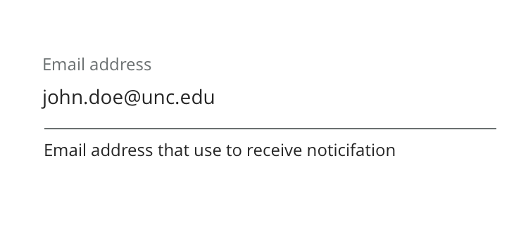
Error with information text Error text displayed below the existing information text
Information/description text below the inputs.
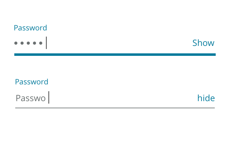
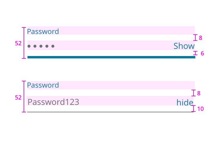
Show/Hide options for password input
Regular Inputs field
Input with no label
| Available Styles | Reference As (How do I use this?) |
|---|---|
| Text Input | [](/design/c/inputs/v2.0.0-beta.3/#rd-text-input) |
| Textarea | [](/design/c/inputs/v2.0.0-beta.3/#rd-textarea) |
| Select Input | [](/design/c/inputs/v2.0.0-beta.3/#rd-select-input) |
| Radio Button | [](/design/c/inputs/v2.0.0-beta.3/#rd-radio-button) |
| Checkbox | [](/design/c/inputs/v2.0.0-beta.3/#rd-checkbox) |
| Label | [](/design/c/inputs/v2.0.0-beta.3/#rd-label) |
| Search Input | [](/design/c/inputs/v2.0.0-beta.3/#rd-search-input) |
Change design to align with new brand
Initial version