Tab Style Navigation
Search the component library

Tab Style Navigation

v2.0.0

This component defines the standard visual style, as well as some basic behavior for tab style navigation.

Usage Guidelines

Tab Style “Navigation” refers to a general ability to organize and choose the primary content to display. This is purposefully broad to include linking to a separate page or staying on the same page.

Note - This does not cover “Tab Panel” specific guidance where keyboard arrows can be used to switch tabs on a single page.

Features

  • Definition of tab visual style, including state changes
  • Definition of uses case context

Basic Tabs

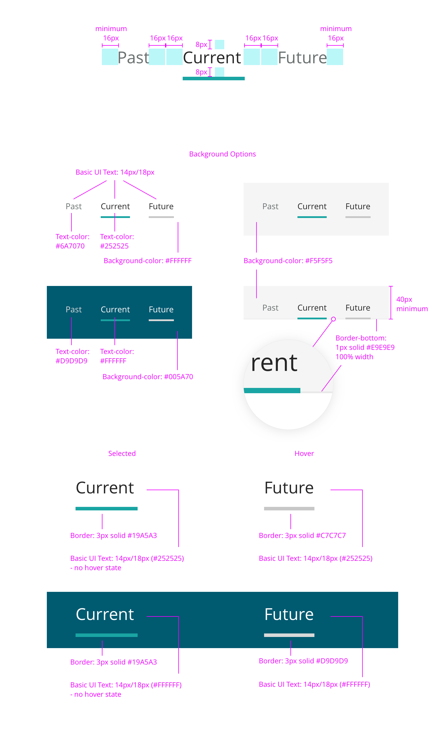
Tabs make it easy to explore and switch between different views. Tabs enable content organization at a high level, such as switching between views, data sets, or functional aspects of an app. Present tabs as a single row above their associated content. Tab labels should succinctly describe the content within.
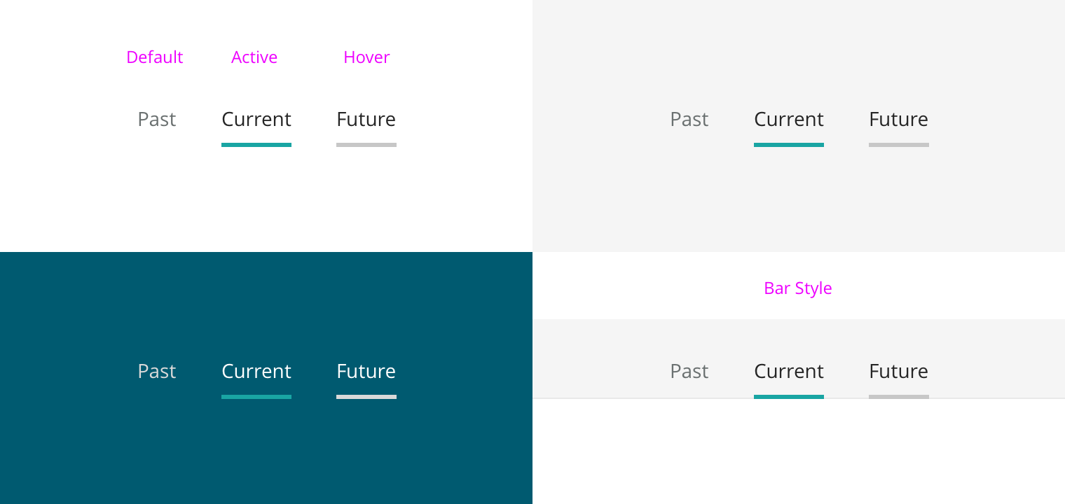
States

Default State indicates the typical appearance of an available, but not selected tab.

Active State indicates the currently selected tab, whose associated content is currently being displayed.

Hover State indicates the appearance of a tab being hovered.

Choosing a background

For a consistent experience, use an approved background color combination. Always choose based on your specific needs.

For inline contents, single color backgrounds tend to be best. For page level contents, “Bar Style” tend to work well.

Maintain the aesthetics of clarity with generous padding, especially if using a single color background.

Naming tabs

Try to use concise, single word names. This helps maintain the aesthetics and usability of clarity. However, if a tab cannot convey its contents clearly in a single concise word, reach out to a UX Writer and/or expand as needed.

Tab states and backgrounds

Responsive Web Design

These strategies describe how this component changes in response to insufficient width. This is accomplished by collapsing tabs into standard dropdown menus. How the tabs are placed into a dropdown is defined by collapsing style.

Collapsing Styles

This component has two available options for how tabs are placed into the dropdown. The appropriate style is dependent on the specific use case.

Progressive

Use this style to show some tabs while also allowing access to the rest with a dropdown. Tabs will be placed into a “More” dropdown, progressively, from right-to-left

Arrange the most important tabs from the left-to-right. This allows the greatest likelihood of explicitly displaying the most important tabs to users regardless of screen size.

Note - the active tab cannot be placed into the “More” dropdown.

All-In-One

Use this style to collapse all tabs into a single dropdown. This can be used useful if you don’t want to increase access to certain tabs over others and/or want to maintain a simpler aesthetic. In this case, the dropdown label is defined as the active tab, serving as a title of sorts.

Note - This component may eventually reduce down to the All-In-One style, even if the Progressive Style is used, when width will not allow two tabs and the “more” dropdown to be shown. If this is not desired, be sure to use concise naming of tabs.

This component uses our standard dropdown, which is driven by display size.

Large and Extra Large - Optimized for use with a pointer.

Extra Small, Small, and Medium- Optimized for use with a finger.

Collapsing Styles

Dropdown for L and XL displays

Dropdown for XS, S, and M displays

Redlines

Padding
  • 8px vertical padding, above and below tab text
  • 32px (16x2) horizontal padding, between tabs
Background Options

Light Backgrounds

Default
Active
Hover

Dark Backgrounds

Default
Active
Hover

Redlines for different tab states

Changelog

2.0.0

Initial rebranded version