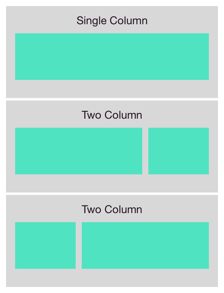
Templates
Search the component library

Templates

v2.0.0-beta.2
Download UI Kit v1.9.0

A standard set of page structures for a variety of use cases.

Download UI Kit v1.9.0

Usage Guidelines

Every page should utilize one or more of these templates to create its high level structure.

Features

  • Consistent dimensions for a variety of useful page structures
  • Responsive strategies for each template
  • Accessible implementation

Template usage

Stacking

Multiple templates may be stacked to create a single page.
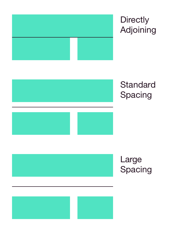
Spacing

The joints can either abut directly or use the predefined standard/large spacings.
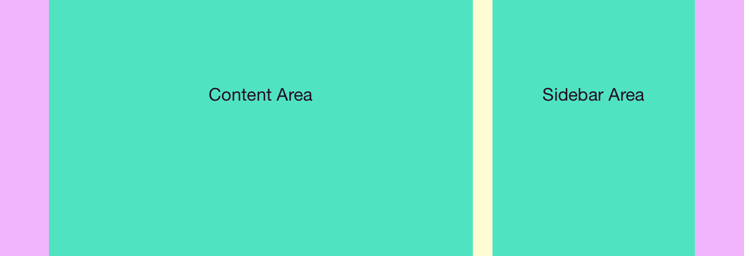
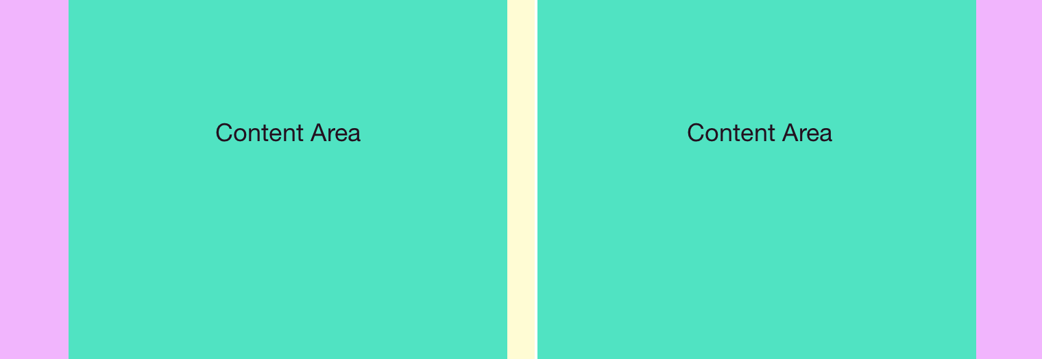
Backgrounds

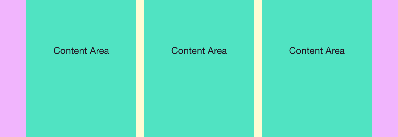
Each template may specify it’s own full width border (color or image) or let the default background show through.

Borders

Stacked templates may also specify separating borders, either container width or full viewport width.

Presentation Strategies

Templates define set layout areas which are designed to work with the Presentation Strategies component for actually filling them with content.

Responsive Behavior

Each template can be used at any breakpoint, although some will be more suited to larger or smaller viewports. Designers should specify which template applies to each breakpoint when designing a page.

A page consisting of three stacked layouts. The gray areas are where full width backgrounds would go.

The three spacings available for stacked templates. (Shown with container width borders.)

Single Column

12 column

The simplest page template, it takes up the full 12 columns available at every breakpoint.

The 12 column layout.

10 Column

Use this slightly narrower single column for content which would look stretched if it took up all 12 columns.

A 10 column template.

Static Columns

The static column presents a single column of fixed width which is centered in the page. It comes in three different sizes (small at 440px, medium at 600px, and large at 800px) and is handy for presenting modals or small pieces of content like sign in forms.

A column of static width at larger viewports.

Two Column

4/8 Template

This template devotes 8 columns to a main content area and the remaining 4 to a sidebar which appears on either side (prefer the right where it makes sense).

The 4/8 column template with the sidebar on the right.

6/6 template

Evenly splits the page between two equal columns.

The 6/6 column template provides two equal width content areas

Three Column

4/4/4 Template

Evenly splits the page into three equal columns.

Example of the three column template.

Redlines

Shared Features

Spacing
  • Directly adjoining templates have no vertical space between them
  • Small Gap is 40px total
  • Large Gap is 80px total
Backgrounds & Borders
  • Each template section may include a full width border (either color or image)
  • Two template sections may be divided with a border that is either full page width or just 12 columns wide

Stacked templates with background areas indicated in gray.

The three types of spacing available with grid width borders.

Single column

12 Column
10 Column
  • Occupies the interior 10 columns at all breakpoints
Static Column
  • Occupies a fixed width which is centered in the page
  • Small is 440px, medium is 600px, large is 800px
  • These should not be used at viewports that are too narrow

The single column template. Each variation simply offers a different width which may be dynamic based on the viewport or static.

Two column

4/8 Template
  • Main area is 8 grid columns wide, sidebar is 4 columns
  • Prefer to locate the sidebar on the right, but both are acceptable
6/6 Template

An example two column template that divides the page into two content areas.

Three column

4/4/4 Template

Example of the three equal column template.

Available Styles Reference As (How do I use this?)
Single column [](/design/c/templates/v2.0.0-beta.2/#rd-single-column)
Two column [](/design/c/templates/v2.0.0-beta.2/#rd-two-column)
Static column [](/design/c/templates/v2.0.0-beta.2/#rd-static-column)

Changelog

2.0.0-beta.2

  • CHANGED: Updated to no longer require a full responsive specification for each template. Instead designers can mix and match different templates at each breakpoint.
  • CHANGED: The 480px wide static column is now 440px wide.
  • ADDED: 600px static column template.
  • ADDED: Three equal column template.

2.0.0-beta.1

  • REMOVED: Option for two column layout to switch DOM order of main and sidebar ares.
  • UPDATED: Uses latest Grid dependency.

1.0.0

Initial version.