Typography
All textual elements use the following font stacks:
font-family: 'Helvetica Neue', Helvetica, Arial, sans-serif;
font-family: Monaco, 'Lucida Console', monospace;
This component provides standard typographic styles for the platform.
Usage Guidelines
Every instance of text should use a type style defined in this component. If you find a use case not covered by the styles here, make a request to modify this component. (Keeping all type styles in a single component makes it easy to maintain and update them.)
Features
All textual elements use the following font stacks:
font-family: 'Helvetica Neue', Helvetica, Arial, sans-serif; font-family: Monaco, 'Lucida Console', monospace;
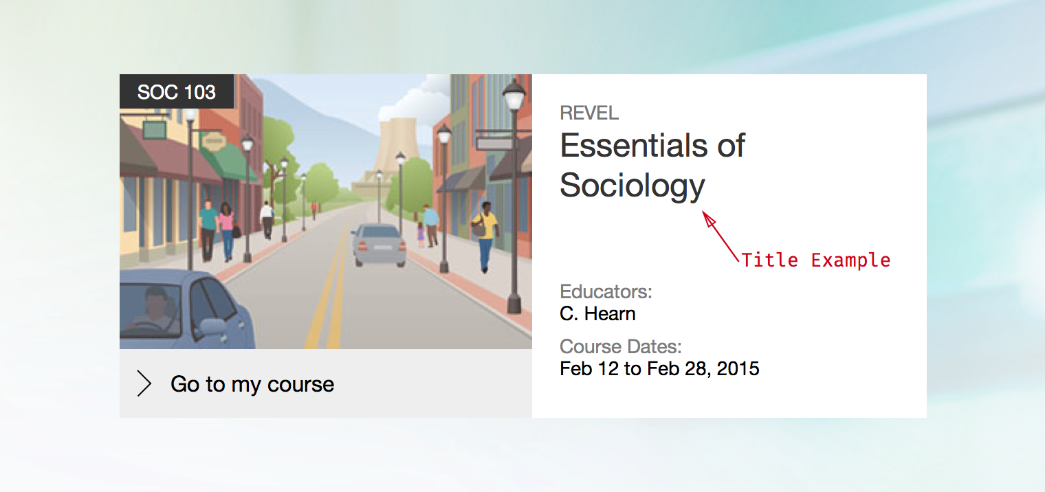
Much of the typography used in a web application consists of short names, labels, or single line bits of content. For example, in Console the course tile displays information like instructor names and course dates with labels.
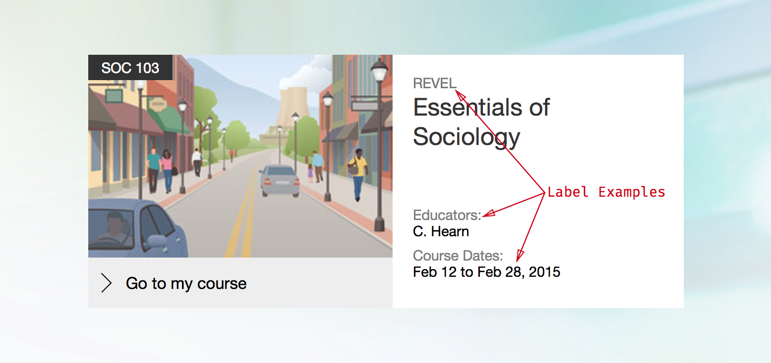
An example of labels in use on the Console course tile
There are four different sizes of label, Basic, Small, Large, and Bold:
Labels should primarily be used in single line scenarios. Make a particular effort to avoid using bold labels in a multi-line manner.
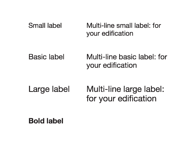
The four label sizes
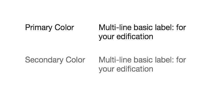
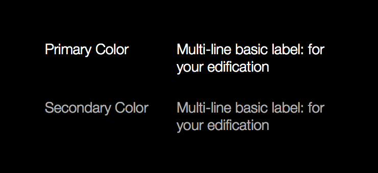
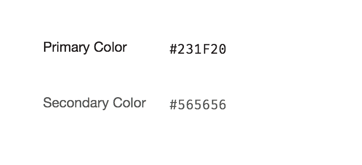
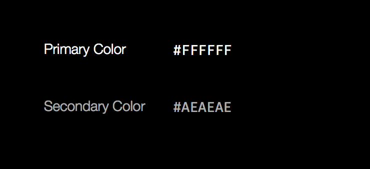
Labels come in two colors, Primary and Secondary. There is an inverse palette available as well.
Standard colors
Inverse colors
Inverse colors
Inverse colors
Inverse colors
In general, labels should not be styled beyond the basic styles listed above. If necessary, stick to the following list of inline elements.
<em>, <i><a><small><time><abbr>Titles are very similar to labels except they demarcate a logical section or container of content. In the previous example, the course name would be a title.
Standard colors
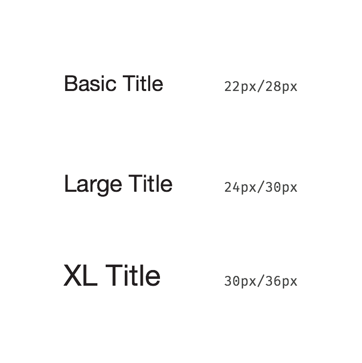
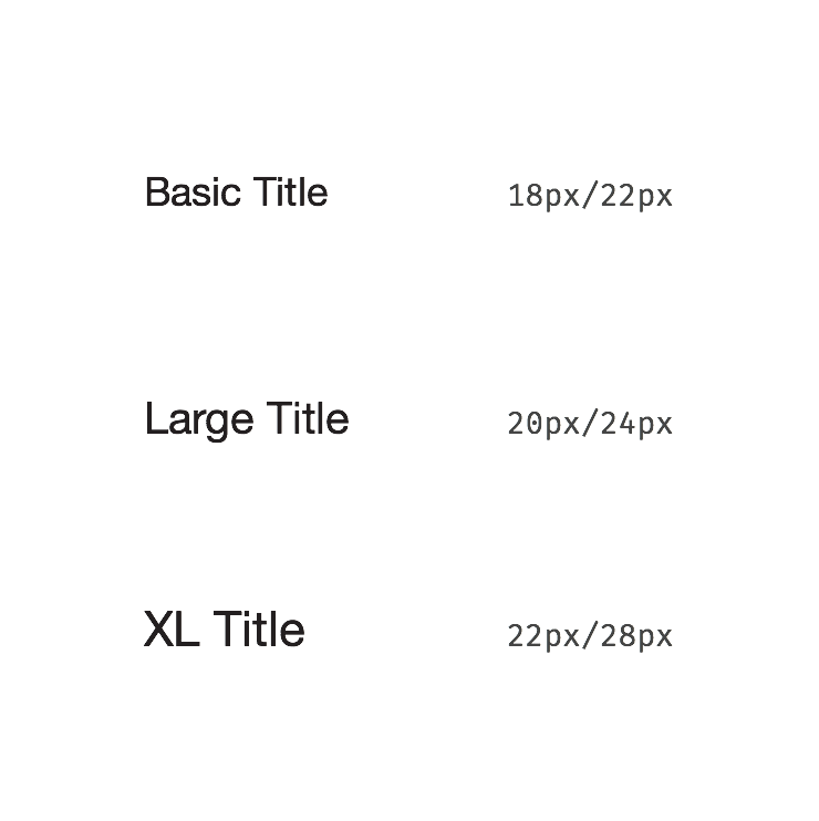
There are three different sizes of title: Basic, Large, and Extra Large. These sizes will automatically scale down in narrow viewports.
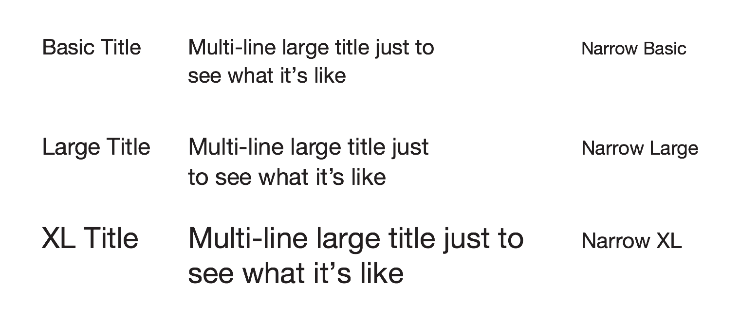
Standard title sizes, multiline versions, and the responsive sizes used when the viewport is narrower.
In general, titles should not be styled beyond the basic styles listed above. If necessary, stick to the following list of inline elements.
<em>, <i><small><time><abbr>When you have a chunk of content to display, use one of these styles.
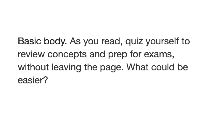
Most regular content will use the Basic Body style.
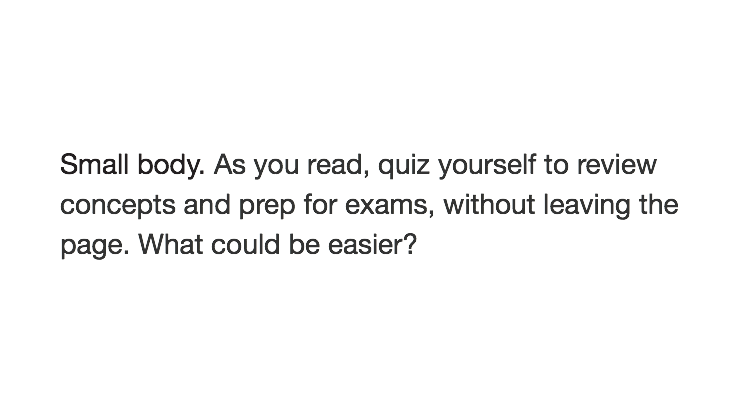
There is a smaller variant available which should be used when the line length is shorter.
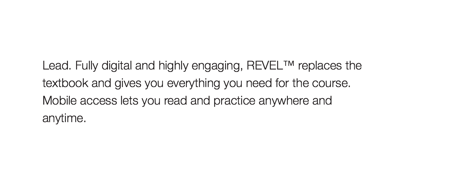
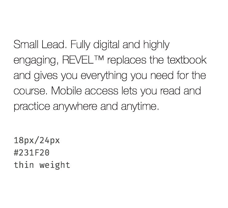
There is also a Lead variant which can be used for the first paragraph of a message or as part of a hero block for marketing materials.
It will automatically scale down for narrow viewports as well.
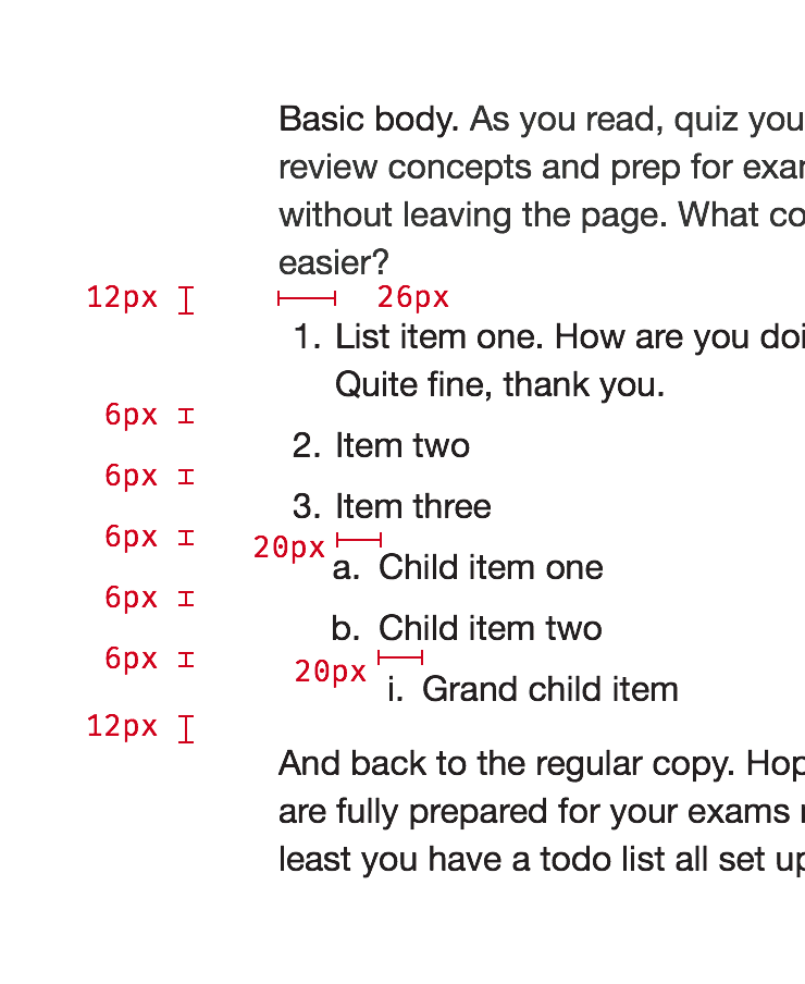
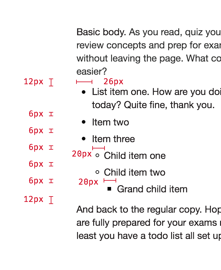
Both ordered and unordered lists are supported with a nesting depth of three. These should be used to present content within a copy block, not for UI elements.
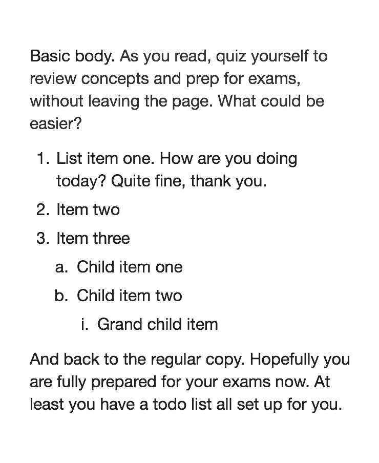
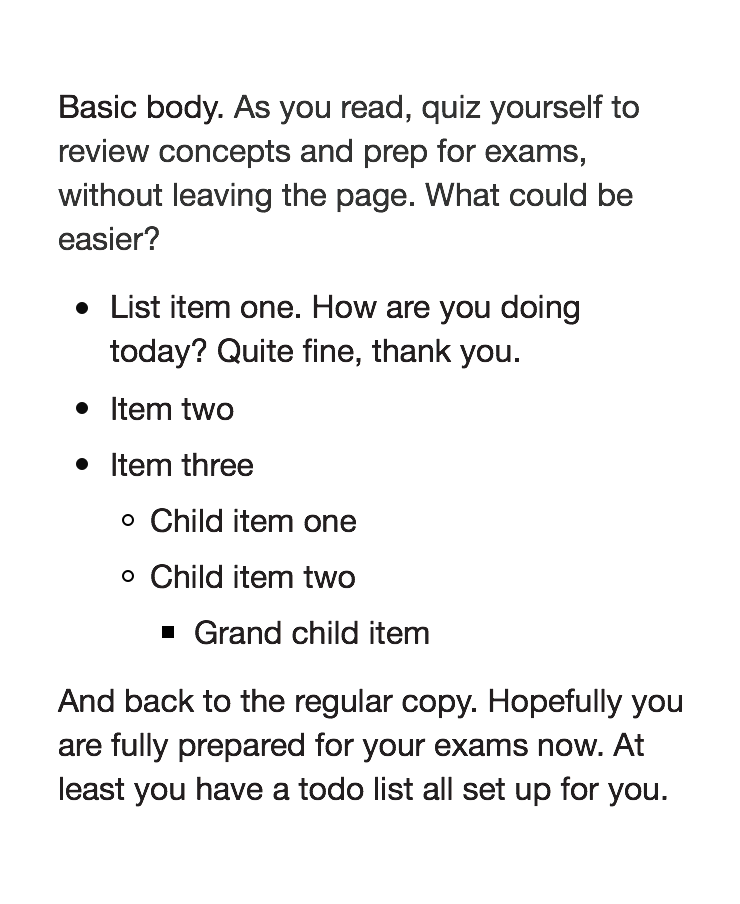
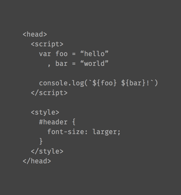
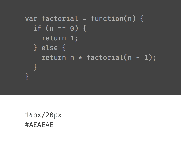
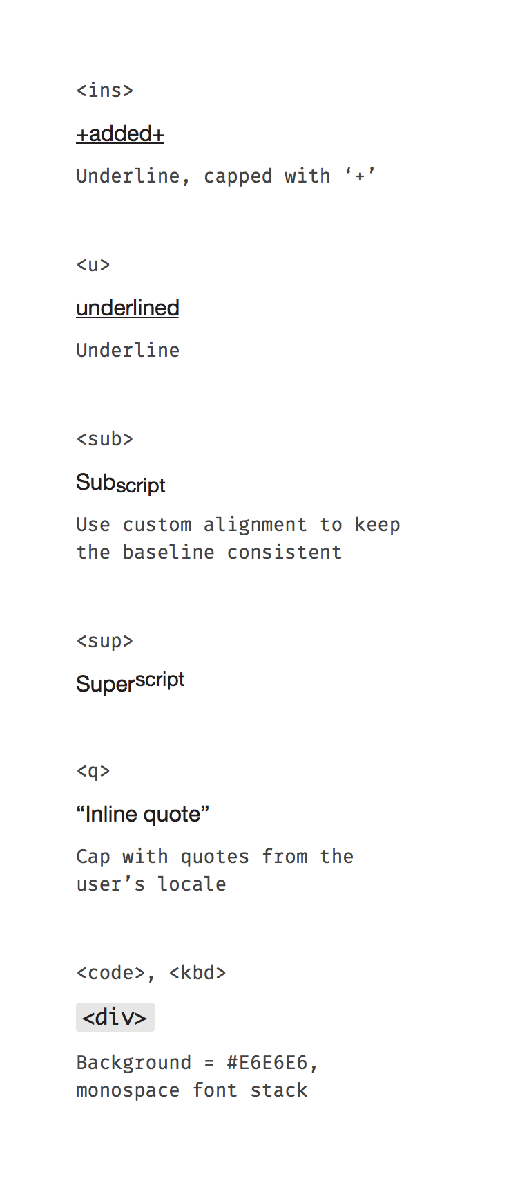
Blocks of code (typically <pre> tags) are styled on a dark background. (See also the inline elements <code> and <kbd>.)
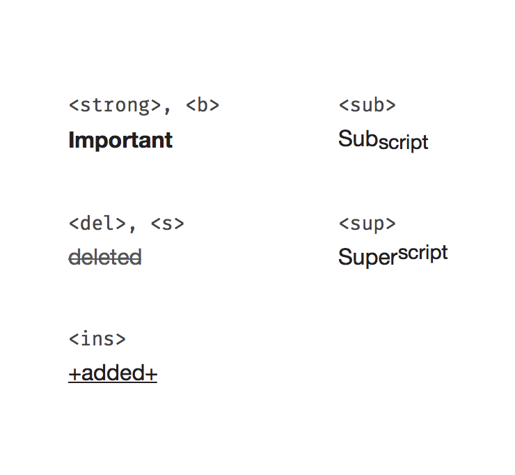
Copy is more flexible in this regard that labels or titles. You can include any of the inline elements covered by this component.
There are a number of inline elements which can be used to modify the other type styles (see the list of allowed inline elements for each type style).
<a><em>, <i><strong>, <b><u><del>, <s><ins><q><sub>, <sup><mark><code>, <kbd>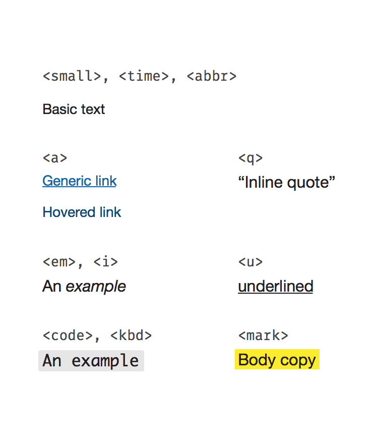
Some inline elements should be used only for semantic reasons and don’t effect the visual style. These include:
<small> (note: this element is used to represent side-comments and small print, including copyright and legal text, independent of its styled presentation)<time><abbr>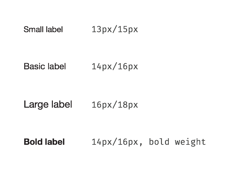
| Available Styles | Reference As (How do I use this?) |
|---|---|
| Basic Label | [](/design/c/typography/v1.0.0/#rd-basic-label) |
| Small Label | [](/design/c/typography/v1.0.0/#rd-small-label) |
| Large Label | [](/design/c/typography/v1.0.0/#rd-large-label) |
| Bold Label | [](/design/c/typography/v1.0.0/#rd-bold-label) |
| Available Styles | Reference As (How do I use this?) |
|---|---|
| Primary Label Color | [](/design/c/typography/v1.0.0/#rd-primary-label-color) |
| Secondary Label Color | [](/design/c/typography/v1.0.0/#rd-secondary-label-color) |
| Inverse Primary Label Color | [](/design/c/typography/v1.0.0/#rd-inverse-primary-label-color) |
| Inverse Secondary Label Color | [](/design/c/typography/v1.0.0/#rd-inverse-secondary-label-color) |
At extra small viewports:
All titles are colored Pitch (#231f20).
Regular title sizes
Title sizes for narrow viewports (< 480px)
| Available Styles | Reference As (How do I use this?) |
|---|---|
| Basic Title | [](/design/c/typography/v1.0.0/#rd-basic-title) |
| Large Title | [](/design/c/typography/v1.0.0/#rd-large-title) |
| XL Title | [](/design/c/typography/v1.0.0/#rd-xl-title) |
p tags up to the consumer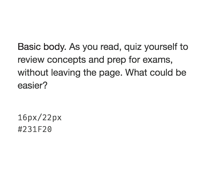
Standard body copy
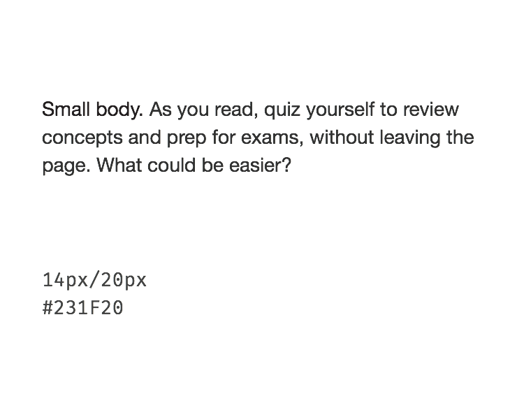
Smaller body copy used for narrower line length
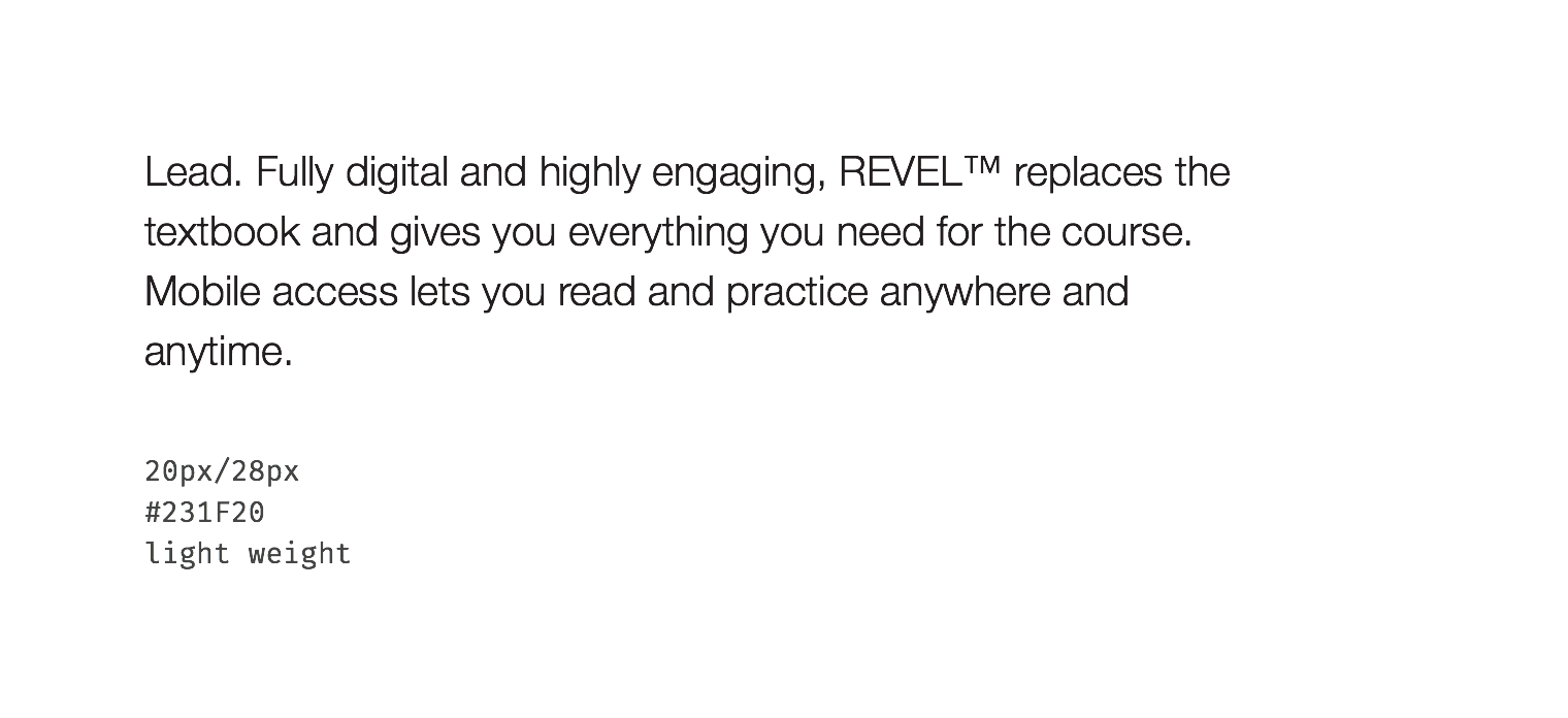
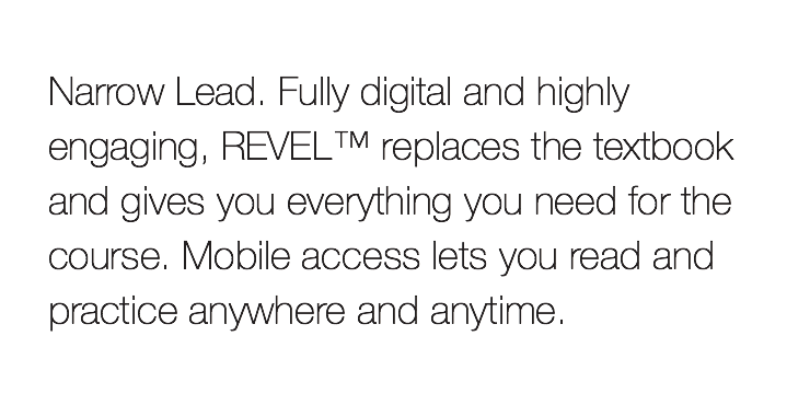
At extra small viewports the lead styles become:
These lists should be used to communicate content within a copy block, not as UI elements.
| Available Styles | Reference As (How do I use this?) |
|---|---|
| Basic Body | [](/design/c/typography/v1.0.0/#rd-basic-body) |
| Small Body | [](/design/c/typography/v1.0.0/#rd-small-body) |
| Lead | [](/design/c/typography/v1.0.0/#rd-lead) |
| Ordered List | [](/design/c/typography/v1.0.0/#rd-ordered-list) |
| Unordered List | [](/design/c/typography/v1.0.0/#rd-unordered-list) |
| Code | [](/design/c/typography/v1.0.0/#rd-code) |
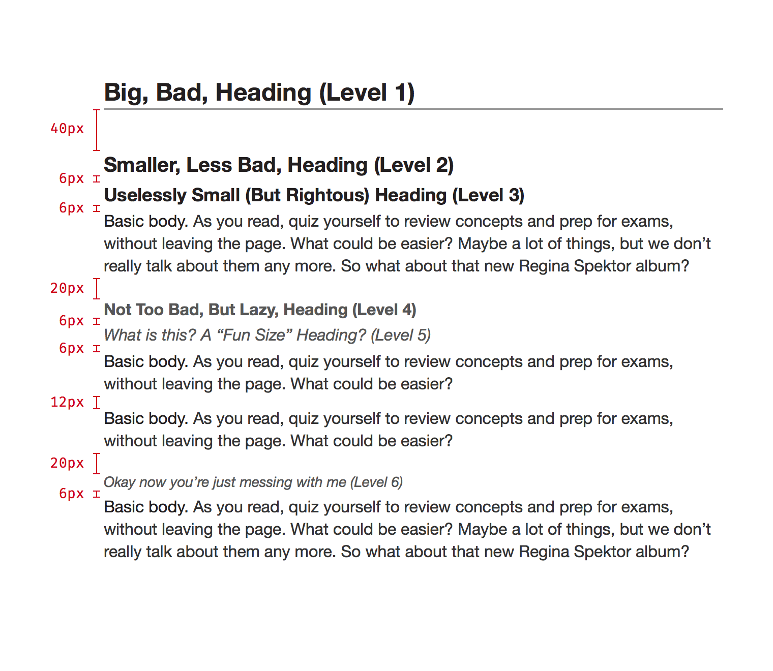
Margins can be customized to meet a layout if necessary.
| Available Styles | Reference As (How do I use this?) |
|---|---|
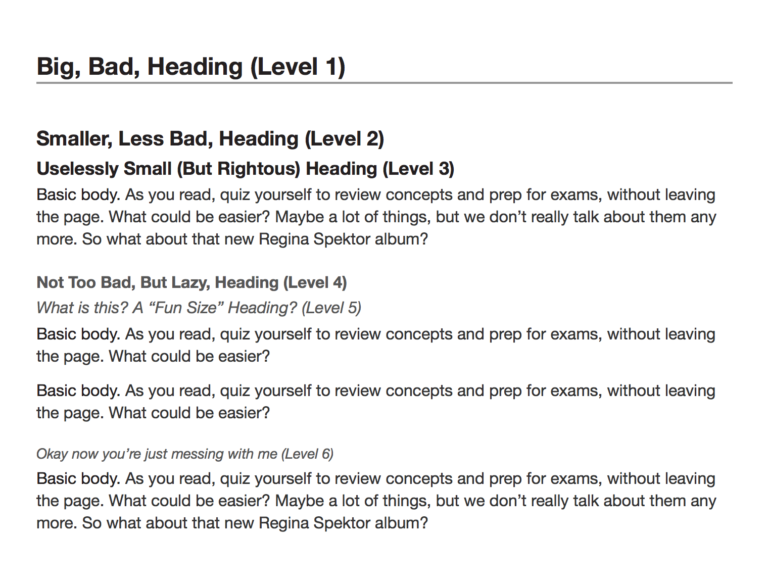
| Heading Level 1 | [](/design/c/typography/v1.0.0/#rd-heading-level-1) |
| Heading Level 2 | [](/design/c/typography/v1.0.0/#rd-heading-level-2) |
| Heading Level 3 | [](/design/c/typography/v1.0.0/#rd-heading-level-3) |
| Heading Level 4 | [](/design/c/typography/v1.0.0/#rd-heading-level-4) |
| Heading Level 5 | [](/design/c/typography/v1.0.0/#rd-heading-level-5) |
| Heading Level 6 | [](/design/c/typography/v1.0.0/#rd-heading-level-6) |
<small>, <time>, <abbr><a><mark><em>, <i><strong>, <b><del>, <s><ins><sup><sub><q><code>, <kbd>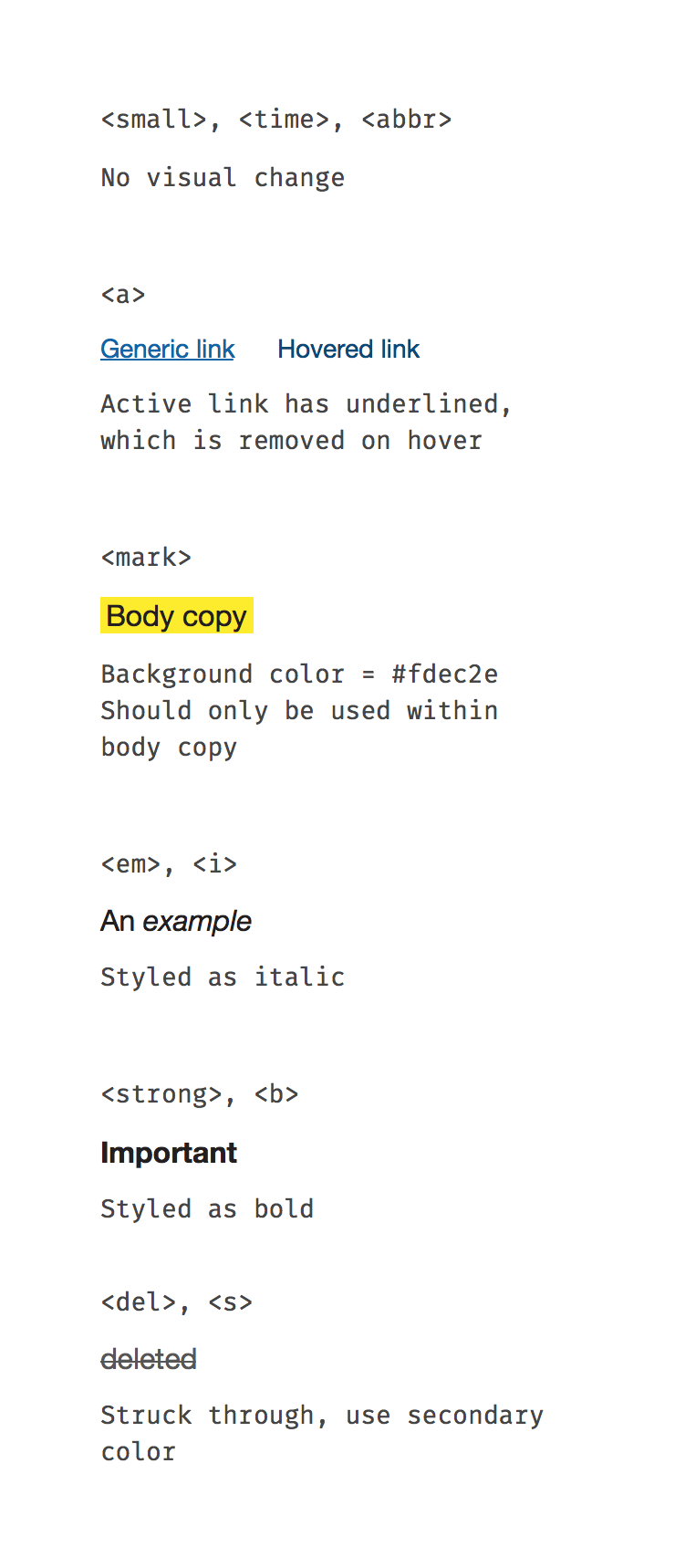
| Available Styles | Reference As (How do I use this?) |
|---|---|
| small, time, abbr tags | [](/design/c/typography/v1.0.0/#rd-small-time-abbr-tags) |
| Links | [](/design/c/typography/v1.0.0/#rd-links) |
| Highlighted Text | [](/design/c/typography/v1.0.0/#rd-highlighted-text) |
| Italic Text | [](/design/c/typography/v1.0.0/#rd-italic-text) |
| Bold Text | [](/design/c/typography/v1.0.0/#rd-bold-text) |
| Deleted Text | [](/design/c/typography/v1.0.0/#rd-deleted-text) |
| Inserted Text | [](/design/c/typography/v1.0.0/#rd-inserted-text) |
| Superscript, Subscript | [](/design/c/typography/v1.0.0/#rd-superscript-subscript) |
| Inline Quoted Text | [](/design/c/typography/v1.0.0/#rd-inline-quoted-text) |
| code, kbd tags | [](/design/c/typography/v1.0.0/#rd-code-kbd-tags) |
Initial version