Inputs
An input is a field used to save a response from a user.
Labels
All inputs must have direct labels, even when the visual design has the field physically close to other text which can give some users a good idea of what to fill in. Labels need to be programmatically associated with the inputs, by having a for attribute which matches the input's (unique to the page!) id attribute.
Wrapping a label around an input (which avoids the need for using for and id pairing) is legal and valid HTML. However there are some assistive tech which are buggy with this setup and have been for many years (differing browsers and AT have had problems at different times). For this reason, ElementsSDK encourages separate labels with programmatic association (for and id matching attributes).
Required vs Optional fields
In addition to stating the field's required-ness in the label, the input itself can have either a required attribute (this may trigger a browser's built-in error messaging) or aria-required. These are boolean attributes. Some developers prefer using aria-required as it tells users of assistive technology (AT) that the field is required without triggering the browser's default error messages. You should not use both of these attributes on the same input.
Placeholders
Placeholders are shown here so consuming teams can see what they look like in the current Elements design. However, they are generally not recommended. If they are merely repeating what the label says, they are little more than distractions and may fool end-users into thinking the inputs are already filled in (see nngroup research). If the placeholder offers useful hints (such as the desired formatting of data), consider adding this as info text under the input and linked using aria-describedby, or adding it to the label (see placing hints outside inputs).
Error states
When someone has made an error, the error state should be clear and obvious, as well as what exactly the problem is. For some assistive tech users, we can programmatically associate an error message with its input using aria-describedby, and we can set the input's state with aria-invalid.
aria-describedby's value is the id of the element with the message you want to link. aria-invalid can either be used as a boolean, or it can have a type as a value (aria-invalid="spelling" for example).
Be aware: hiding an error message that is present in the DOM using display: none or visibility: hidden will still have that error message read out to screen reader users when they focus on the input, even when the input is not in an error state.
The message or the input's aria-describedby link to the message cannot be present in the DOM until there is an error state.
When there is no error state, any of these techniques will work:
- leave the error message absent (empty element) until the input is shown invalid
- don't have the error element present at all (appears when there's an error state)
- don't have the error element have the matching id
- don't have the error element's id in the
aria-describedbyvalue
The aria-invalid attribute should only be set to true after validation, not before.
Readonly and disabled states
An input in a readonly state is focusable, and any value inside it is selectable and copyable. Inside a form, the value in a readonly field is sent with other fields to the backend script when the form is submitted. A disabled input is not focusable and its values are not accessible to users. Disabled controls and inputs are not required to pass color contrast minimums. Screen reader users can find and read disabled controls, but no users can tab to them. Values in disabled fields are not sent to a form's backend script when the form is submitted.
Single line text inputs
Fancy
 <label class="pe-textLabelInput__label" for="name1">First Name</label>
 <input type="text" class="pe-textInput" id="name1" placeholder="weee I'm placeholder">
 <span class="pe-input_underline"></span>
Fancy (focus)
This is just showing that when the input has focus, the label should turn blue. This needs JavaScript to show, and is not naturally included in Elements css.
 <label class="pe-textLabelInput__label--label_focus" for="name1_again">First Name</label>
 <input type="text" class="pe-textInput" id="name1_again" placeholder="m0ar placeholder">
 <span class="pe-input_underline"></span>
Fancy (error)
 <label class="pe-textLabelInput__label--label_error" for="name2">First Name</label>
 <input type="text" class="pe-textInput--input_error" id="name2" value="Cher" aria-describedby="someError" aria-invalid="true">
 <span class="pe-inputError_underline"></span>
 <span id="someError" class="pe-input--error_message">this is an error message</span>
Fancy (disabled)
 <label class="pe-textLabelInput__label" for="name3">First Name</label>
 <input type="text" class="pe-textInput" id="name3" value="The Donald" disabled>
Fancy (readonly)
 <label class="pe-textLabelInput__label" for="name4">First Name</label>
 <input type="text" class="pe-textInput--input_readonly" id="name4" value="The Donald" readonly>
Non-fancy Inputs
Basic single line input
  <label class="pe-textLabelInput__label" for="anInput">Label</label>
  <input type="text" class="pe-textInput--basic" id="anInput" aria-describedby="someHint">
  <span id="someHint" class="pe-input--info_message">this is an info message</span>
Basic (focus)
This is just showing that when the input has focus, the label should turn blue. This needs JavaScript to show, and is not naturally included in Elements css.
  <label class="pe-textLabelInput__label--label_focus" for="anotherInput">Label</label>
  <input type="text" class="pe-textInput--basic" id="anotherInput" placeholder="Example placeholder">
Basic (error)
  <label class="pe-textLabelInput__label--label_error" for="emailz">Email address</label>
  <input type="text" class="pe-textInput--basic_error" id="emailz" value="email@domain" aria-invalid="true" aria-describedby="no_tld_error">
  <p id="no_tld_error" class="pe-input--error_message">This address looks like it's missing the TLD.</p>
Basic (disabled)
  <label class="pe-textLabelInput__label" for="x">Label</label>
  <input type="text" class="pe-textInput--basic" id="x" disabled value="some pre-filled value">
Basic (readonly)
  <label class="pe-textLabelInput__label" for="y">Label</label>
  <input type="text" class="pe-textInput--input_readonly" id="y" value="read only" readonly>
Password inputs
Fancy password
  <label for="PasswordInputFancy" class="pe-textLabelInput__label">Set a Password</label>
  <input type="password" id="PasswordInputFancy" class="pe-textInput" aria-describedby="password_hint">
  <span class="pe-input_underline"></span>
  <button type="button" id="showbutton-PasswordInputFancy" class="pe-textInput__showButton">show<span class="pe-sr-only"> password</span></button>
  <span id="password_hint" class="pe-input--info_message">Password must contain 1 uppercase letter, 1 lowercase letter, the Fibonacci sequence, a solution to the healthcare crisis, and a copy of your DNA.</span>
** This needs JavaScript to action show/hide function, and label focus ** https://github.com/Pearson-Higher-Ed/compounds/src/TextInput
Fancy password (error)
  <label for="PasswordInputFancyError" class="pe-textLabelInput__label--label_error">Set a Password</label>
  <input type="password" id="PasswordInputFancyError" class="pe-textInput--input_error" aria-describedby="password_error2 password_hint2" aria-invalid="true">
  <span class="pe-inputError_underline"></span>
  <button type="button" id="showbutton-PasswordInputFancyError" class="pe-textInput__showButton--error">show</button>
  <span id="password_hint2" class="pe-input--info_message">This is an info message</span>
  <span id="password_error2" class="pe-input--error_message">This is an error message</span>
Fancy password (readonly)
Consider the usefulness (or not) of a readonly password input.
  <label for="PasswordInputFancyReadOnly" class="pe-textLabelInput__label">Your chosen password</label>
  <input type="password" id="PasswordInputFancyReadOnly" readonly class="pe-textInput--input_readonly" aria-describedby="password_hint3" value="c0rrecthorse_batteryStaple">
  <span class=""></span>
  <button type="button" id="showbutton-PasswordInputFancyReadOnly" class="pe-textInput__showButton">show</button>
  <span id="password_hint3" class="pe-input--info_message">This is an info message</span>
Fancy password (disabled)
  <label for="PasswordInputFancyDisabled" class="pe-textLabelInput__label">Choose a password</label>
  <input type="password" id="PasswordInputFancyDisabled" disabled class="pe-textInput">
  <span class=""></span>
  <button type="button" id="showbutton-PasswordInputFancyDisabled" disabled class="pe-textInput__showButton--disabled">show</button>
Basic password
  <label for="PasswordInputBasic" class="pe-textLabelInput__label">Password: </label>
  <input type="password" id="PasswordInputBasic" placeholder="not your pet's first name" class="pe-textInput--basic">
  <button type="button" id="showbutton-PasswordInputBasic" class="pe-textInput__showButton-basic">show</button>
  <span id="pw_hint" class="pe-input--info_message">This is an info message</span>
  <span id="pw_error" class="pe-input--error_message"></span>
Basic password (error)
  <label for="PasswordInputBasicError" class="pe-textLabelInput__label--label_error">Password: </label>
  <input type="password" id="PasswordInputBasicError" value="star wars" class="pe-textInput--basic_error" aria-invalid="true" aria-describedby="pw_error2 pw_hint2">
  <button type="button" id="showbutton-PasswordInputBasicError" class="pe-textInput__showButton-basic">show</button>
  <span id="pw_hint2" class="pe-input--info_message">"star wars" is a terrible password. So is "12345" and "1a2b3c4d" and "password". Don't use these.</span>
  <span id="pw_error2" class="pe-input--error_message">Srsly. Choose something more secure.</span>
Basic password (disabled)
  <label for="PasswordInputBasicDisabled" class="pe-textLabelInput__label">Password</label>
  <input type="password" id="PasswordInputBasicDisabled" value="c0rrecthorse_batteryStaple" disabled class="pe-textInput--basic">
  <button type="button" id="showbutton-PasswordInputBasicDisabled" disabled class="pe-textInput__showButton-basic--disabled">show</button>
Basic password (readonly)
  <label for="PasswordInputBasicReadOnly" class="pe-textLabelInput__label">Password</label>
  <input type="password" id="PasswordInputBasicReadOnly" value="zomgwtfbbq" readonly class="pe-textInput--input_readonly">
  <button type="button" id="showbutton-PasswordInputBasicReadOnly" class="pe-textInput__showButton">show</button>
Select Inputs
Select dropdowns are generally meant for times when a user needs to make a single choice from among many options. People can choose more than one option if the mutliple attribute is added, however checkboxes are much more user-friendly for multiple selections.
-
Generally only 1 option is visible at a time, unless the
sizeattribute is present (points to a string representing the number of options visible by default). We recommend leaving size to its default of "1". -
When there is more than 1 option that could be selected, use checkboxes instead.
-
A separate label should be present and visible for the select box. We do not recommend using one of the options to display a question: browsers differ on how they truncate options before the user focuses on selects.
Note: The examples of selects on the design site show checkmarks in the dropdown portion. This is not part of Elements, but comes from the OS (checkmarks are added by Mac OS).
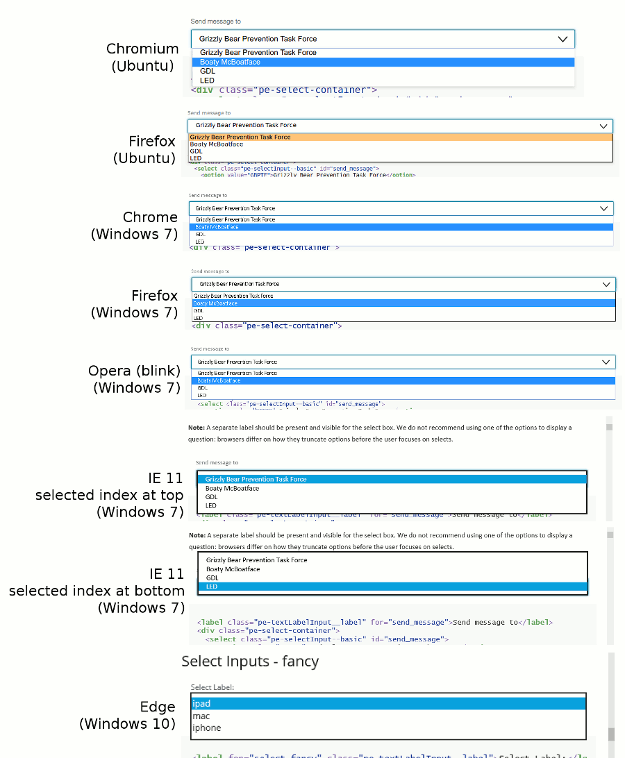
Basic select
<label class="pe-textLabelInput__label" for="send_message">Send message to</label>
<div class="pe-select-container">
  <select class="pe-selectInput--basic" id="send_message">
    <option value="GBPTF">Grizzly Bear Prevention Task Force</option>
    <option value="1234B">Boaty McBoatface</option>
    <option value="GDL">GDL</option>
    <option value="LED">LED</option>
  </select>
  <svg aria-hidden="true"
    focusable="false"
    class="pe-icon--dropdown-open-18">
  <use xlink:href="#dropdown-open-18"></use>
  </svg>
</div>
Basic select (error)
Please note an error state on a select is generally not recommended, as it suggests a mismatch between desired information (user input) and input type. Consider a different input type if users are capable of making a "wrong" selection.
<label class="pe-textLabelInput__label--label_error" for="fout">Error label</label>
<div class="pe-select-container-error">
  <select class="pe-selectInput--basic" id="fout" aria-describedby="select_error">
    <option value="uno">One</option>
    <option value="dos">Two</option>
    <option value="tres">Three</option>
    <option value="quatro">Four</option>
  </select>
  <svg aria-hidden="true"
    focusable="false"
    class="pe-icon--dropdown-open-18">
  <use xlink:href="#dropdown-open-18"></use>
  </svg>
</div>
<p id="select_error" class="pe-input--error_message">error message</p>
Basic select (disabled)
<label class="pe-textLabelInput__label" for="disabled_select">Disabled label</label>
<div class="pe-select-container-disabled">
  <select class="pe-select-container-disabled" id="disabled_select" disabled>
    <option value="uno">One</option>
    <option value="dos">Two</option>
    <option value="tres">Three</option>
    <option value="quatro">Four</option>
  </select>
  <svg aria-hidden="true"
    focusable="false"
    class="pe-icon--dropdown-open-18">
  <use xlink:href="#dropdown-open-18"></use>
  </svg>
</div>
Basic select (readOnly)
Selects don't have a readonly state. To fake it, you would have to remove all the other options with JavaScript. Reconsider using a select input if you need to show one in a readonly state.
<label class="pe-textLabelInput__label" for="readonly_zomg">Readonly label</label>
<div class="pe-select-container-readonly">
  <select class="pe-select-container-readonly" id="readonly_zomg">
    <option value="tres">Three</option>
  </select>
  <svg aria-hidden="true"
    focusable="false"
    class="pe-icon--dropdown-open-18">
  <use xlink:href="#dropdown-open-18"></use>
  </svg>
</div>
<p id="readonly_hint" class="pe-input--info_message">Only valid with coupon</p>
Fancy select
<label for="select_fancy" class="pe-textLabelInput__label">Select Label:</label>
   <div class="pe-select-container--fancy">
      <select id="select_fancy" class="pe-selectInput--fancy" aria-describedby="hinty_mchint">
         <option>ipad</option>
         <option>mac</option>
         <option>iphone</option>
      </select>
      <span class="pe-input_underline"></span>
      <svg focusable="false" aria-hidden="true" class="pe-icon--dropdown-open-18">
         <use xlink:href="#dropdown-open-18"></use>
      </svg>
   </div>
   <span id="hinty_mchint" class="pe-input--info_message">This is an info message</span>
Fancy select (error)
<label for="select_fancy_error" class="pe-textLabelInput__label--label_error">Select Label:</label>
   <div class="pe-select-container-fancy-error">
      <select id="select_fancy_error" class="pe-selectInput-fancy-error" aria-invalid="true" aria-describedby="fancy_error">
         <option>ipad</option>
         <option>mac</option>
         <option>iphone</option>
      </select>
      <span class="pe-inputError_underline"></span>
      <svg focusable="false" aria-hidden="true" class="pe-icon--dropdown-open-18">
         <use xlink:href="#dropdown-open-18"></use>
      </svg>
   </div>
   <span id="fancy_error" class="pe-input--error_message">This is an error message</span>
Fancy select (disabled)
<label for="select_disabled" class="pe-textLabelInput__label">Select Label:</label>
   <div class="pe-select-container-fancy-disabled">
      <select id="select_disabled" disabled class="pe-selectInput-fancy-disabled">
         <option>ipad</option>
         <option>mac</option>
         <option>iphone</option>
      </select>
      <span class=""></span>
      <svg focusable="false" aria-hidden="true" class="pe-icon--dropdown-open-18">
         <use xlink:href="#dropdown-open-18"></use>
      </svg>
   </div>
Fancy Select (readonly)
Selects don't have a readonly state. To fake it, you would have to remove all the other options with JavaScript. Reconsider using a select input if you need to show one in a readonly state.
<label for="select_readonly" class="pe-textLabelInput__label">Select Label:</label>
   <div class="pe-select-container-fancy-readonly">
      <select id="select_readonly" disabled="" class="pe-selectInput-fancy-readonly">
         <option>ipad</option>
         <option>mac</option>
         <option>iphone</option>
      </select>
      <span class=""></span>
      <svg focusable="false" aria-hidden="true" class="pe-icon--dropdown-open-18">
         <use xlink:href="#dropdown-open-18"></use>
      </svg>
   </div>
Multiple Line Text/Textarea
Textareas are inputs that allow users to add multiple lines of text. Other elements such as divs can be used to create multiple-line text inputs using the contenteditable attribute (usually for rich-text editors) along with scripting to allow all users to use the div with keyboard, touch, or speech input.
<label class="pe-textLabelInput__label" for="multi_vlaai">Multi-line label</label>
<textarea class="pe-multiLineText" id="multi_vlaai" cols="30" rows="5"
  placeholder="Many words displayed over multiple lines.">
</textarea>
Multiple Line Text (error)
<label class="pe-textLabelInput__label--label_error" for="vlaai_fout">Multi-line label</label>
<textarea class="pe-multiLineText--error" id="vlaai_fout" cols="30" rows="5"
  aria-invalid="true" aria-describedby="vlaai_error">You Can't Have Too Much Truck </textarea>
<p id="vlaai_error" class="pe-input--error_message">Too much truck</p>
Multiple Line Text (disabled)
<label class="pe-textLabelInput__label" for="nope">Multi-line label</label>
<textarea class="pe-multiLineText--disabled" id="nope" cols="30" rows="5" disabled> </textarea>
Multiple Line Text (readonly)
<label class="pe-textLabelInput__label" for="andale">Multi-line label</label>
<textarea class="pe-multiLineText--readOnly" id="andale" cols="30" rows="5" readonly>TERMS AND CONDITIONS. You ("you") agree to giving up an arm, a leg, your first born, and your dawg. These terms may be changed at any time without warning.
3. TRANSFER. You may not rent, lease, lend, sell, redistribute, or sublicense the iOS software. You may, however (a)
Oh you know what? This is page 46, nobody's still reading this. I bet only about five people clicked to read the T&Cs in the first place - we might as well just say anything we like.
Tony on floor 5 of Apple HQ smells of sardines.
When someone sends a funny email around the offices we have to reply with iLaughed. It's in our job description.
Remember that legal kerfuffle over Apple & Apple studios? Want to know how we fixed it? We bought The Beatles. We have the surviving ones come and sing to us for scraps. We're looking at ways to reanimate the dead ones.
The canteen only sells apple products. Apples, apple juice, apple flapjacks, toffee apples. We get fired if we're caught eating anything without apples in it. I'M ALLERGIC TO APPLES AND I'M ALWAYS HUNGRY.
We faked the moon landings. Did it in 2008, then brainwashed you all to believe it happened in 1969, just because we could. If anyone finds out I've leaked this information, I'll be killed. But no one will ever, ever read this.</textarea>
Checkbox
Checkboxes are for times when the user needs to make one or more binary choices about a related item.
-
Unlike radio buttons, where a group of radio buttons represents a single choice, each check box in a group represents a separate, independent choice.
-
When there is more than one option but only one can be selected, use a radio button instead.
Unselected
    <div class="pe-checkbox">
      <input type="checkbox"  id="checkboxInput" value="1" />
      <label for="checkboxInput">Bacon</label>
      <span>
        <svg aria-hidden="true"
             focusable="false"
             class="pe-icon--check-sm-18">
          <use xlink:href="#check-sm-18"></use>
        </svg>
      </span>
    </div>
Selected
 <div class="pe-checkbox">
   <input type="checkbox" id="checkboxInput2" value="1" checked/>
   <label for="checkboxInput2">Pastrami</label>
   <span>
     <svg aria-hidden="true"
        focusable="false"
        class="pe-icon--check-sm-18">
      <use xlink:href="#check-sm-18"></use>
     </svg>
   </span>
 </div>
Unselected (focus)
(close your eyes and imagine the border is blue, or tab to this to see its focused state)
    <div class="pe-checkbox">
      <input type="checkbox" id="checkboxInput3"/>
      <label for="checkboxInput3">Ham</label>
      <span>
        <svg aria-hidden="true"
             focusable="false"
             class="pe-icon--check-sm-18">
          <use xlink:href="#check-sm-18"></use>
        </svg>
      </span>
    </div>
Selected (focus)
(imagine more blue here)
    <div class="pe-checkbox">
      <input type="checkbox" id="checkboxInput4" checked/>
      <label for="checkboxInput4">Steak</label>
      <span>
        <svg aria-hidden="true"
             focusable="false"
             class="pe-icon--check-sm-18">
          <use xlink:href="#check-sm-18"></use>
        </svg>
      </span>
    </div>
Disabled Selected
    <div class="pe-checkbox">
      <input type="checkbox" id="checkboxInput5" checked disabled/>
      <label for="checkboxInput5">Tripe</label>
      <span>
        <svg aria-hidden="true"
             focusable="false"
             class="pe-icon--check-sm-18">
          <use xlink:href="#check-sm-18"></use>
        </svg>
      </span>
    </div>
Disabled Unselected
    <div class="pe-checkbox">
      <input type="checkbox" id="checkboxInput6" disabled/>
      <label for="checkboxInput6">Meatball</label>
      <span>
        <svg aria-hidden="true"
             focusable="false"
             class="pe-icon--check-sm-18">
          <use xlink:href="#check-sm-18"></use>
        </svg>
      </span>
    </div>
Radio button
Radio buttons are for times when the user needs to make a single choice among many options. Unlike a select box, all options are available and visible to all users at once.
-
Radio buttons are required to be inside a radio group (the most common example is a fieldset element where the fieldset's
<legend>contains the subject the user is making a choice about). They are required to have a label (which names the choice). Thus there is almost always a combination of a subject regarding the group (like a question), and a label per option. -
Radio buttons within a radio group are also required to share the same
nameattribute. There cannot be only 1 radio button in a radio group. -
It is strongly recommended that one of the radio buttons are selected by default, rather than letting browsers choose to either pre-select the first item or leave them all unselected.
-
When a subject line and individual options, or using a fieldset/legend seem unnecessary for your question, consider using a select element instead.
-
When there is more than one option that could be selected, use checkboxes instead.
Example showing unselected, selected, and disabled unselected versions:
<fieldset class="pe-fieldset">
<legend>Which scotch do you like with your cookies?</legend>
<div class="pe-radio">
<input type="radio" name="scotch" id="scotchTB">
<label for="scotchTB">Té Bheag (unselected)</label>
<span>
<svg aria-hidden="true"
focusable="false"
class="pe-icon--radio-dot">
<use xlink:href="#new-notification-9"></use>
</svg>
</span>
</div>
<div class="pe-radio">
<input type="radio" name="scotch" id="scotchMS" checked="checked">
<label for="scotchMS">Monkey Shoulder (selected)</label>
<span>
<svg aria-hidden="true"
focusable="false"
class="pe-icon--radio-dot">
<use xlink:href="#new-notification-9"></use>
</svg>
</span>
</div>
<div class="pe-radio">
<input type="radio" name="scotch" id="scotchT" disabled>
<label for="scotchT">Talisker 18 years (disabled unselected)</label>
<span>
<svg aria-hidden="true"
focusable="false"
class="pe-icon--radio-dot">
<use xlink:href="#new-notification-9"></use>
</svg>
</span>
</div>
</fieldset>
Example showing focused, unselected, and disabled selected versions (developers should avoid offering a focused-but-unselected state by having one option pre-selected). "Focused" state shown visually only; developers do not have to add any inline styles to see this style on real focus events.
<fieldset class="pe-fieldset">
  <legend>Which kinds of cookies do you like with your scotch?</legend>
  <div class="pe-radio">
    <input type="radio" name="cookie" id="cookieCC">
    <label for="cookieCC">Chocolate Chip (unselected)</label>
    <span style="border-color:#047a9c;">
      <svg aria-hidden="true"
           focusable="false"
           class="pe-icon--radio-dot">
        <use xlink:href="#new-notification-9"></use>
      </svg>
    </span>
  </div>

  <div class="pe-radio">
    <input type="radio" name="cookie" id="oreo" disabled checked>
    <label for="oreo">Oreo (disabled selected)</label>
    <span>
      <svg aria-hidden="true"
           focusable="false"
           class="pe-icon--radio-dot">
        <use xlink:href="#new-notification-9"></use>
      </svg>
    </span>
  </div>
</fieldset>
Example showing unselected and focused selected versions. Again, developers do not add inline styles for this effect.
<fieldset class="pe-fieldset">
  <legend>Choose a meat</legend>
  <div class="pe-radio">
    <input type="radio" name="meat" id="bacon">
    <label for="bacon">Bacon (unselected)</label>
    <span>
      <svg aria-hidden="true"
           focusable="false"
           class="pe-icon--radio-dot">
        <use xlink:href="#new-notification-9"></use>
      </svg>
    </span>
  </div>

  <div class="pe-radio">
    <input type="radio" name="meat" id="shortribs" checked>
    <label for="shortribs">Short Ribs (focused selected)</label>
    <span style="border-color:#047a9c;">
      <svg aria-hidden="true"
           focusable="false"
           class="pe-icon--radio-dot">
        <use xlink:href="#new-notification-9"></use>
      </svg>
    </span>
  </div>
</fieldset>
Accessibility Concerns
There can be times when a developer cannot have a fieldset+legend but must for some reason use radio buttons. It is possible to use another wrapping element, such as a div, with role=radiogroup set on it. Additionally for the legend text, if there is nearby text that is visually being relied upon to do the question/subject work, giving that element a unique id can allow you to add aria-describedby="that unique id" on your div.
Cookies
<h2 id="cookiemonster">Cookies</h2>
<div role="radiogroup" aria-describedby="cookiemonster">
  <div class="pe-radio">
    <input type="radio" name="cookiez" id="cookiey" checked>
    <label for="cookiey">Love them</label>
    <span>
      <svg aria-hidden="true"
           focusable="false"
           class="pe-icon--radio-dot">
        <use xlink:href="#new-notification-9"></use>
      </svg>
    </span>
  </div>
  <div class="pe-radio">
    <input type="radio" name="cookiez" id="cookien">
    <label for="cookien">Hate them</label>
    <span>
      <svg aria-hidden="true"
           focusable="false"
           class="pe-icon--radio-dot">
        <use xlink:href="#new-notification-9"></use>
      </svg>
    </span>
  </div>
</div>
If the developer doesn't even have the freedom to wrap the radio buttons, aria-describedby can be used directly as well:
Cookies
<h2 id="cookiemonster2">Cookies</h2>
<div class="pe-radio">
  <input type="radio" name="cookiezz" id="cookieyes" checked aria-describedby="cookiemonster2">
  <label for="cookieyes">Love them</label>
  <span>
    <svg aria-hidden="true"
         focusable="false"
         class="pe-icon--radio-dot">
      <use xlink:href="#new-notification-9"></use>
    </svg>
  </span>
</div>
<div class="pe-radio">
  <input type="radio" name="cookiezz" id="cookieno" aria-describedby="cookiemonster2">
  <label for="cookieno">Hate them</label>
  <span>
    <svg aria-hidden="true"
         focusable="false"
         class="pe-icon--radio-dot">
      <use xlink:href="#new-notification-9"></use>
    </svg>
  </span>
</div>
RadioCheckGroup - (radio)
<fieldset class="pe-fieldset">
   <legend class="pe-legend">These are radio buttons</legend>
   <div class="pe-radio">
      <input type="radio" id="radiocheck-radiobutton2-tea-0" name="radiobutton2" value="tea"> <label for="radiocheck-radiobutton2-tea-0">tea</label>
      <span>
         <svg aria-hidden="true" focusable="false" class="pe-icon--radio-dot">
            <use xlink:href="#new-notification-9"></use>
         </svg>
      </span>
   </div>
   <div class="pe-radio">
      <input type="radio" id="radiocheck-radiobutton2-coffee-1" name="radiobutton2" value="coffee"> <label for="radiocheck-radiobutton2-coffee-1">coffee</label>
      <span>
         <svg aria-hidden="true" focusable="false" class="pe-icon--radio-dot">
            <use xlink:href="#new-notification-9"></use>
         </svg>
      </span>
   </div>
   <div class="pe-radio">
      <input type="radio" id="radiocheck-radiobutton2-soda-2" name="radiobutton2" value="soda"> <label for="radiocheck-radiobutton2-soda-2">soda</label>
      <span>
         <svg aria-hidden="true" focusable="false" class="pe-icon--radio-dot">
            <use xlink:href="#new-notification-9"></use>
         </svg>
      </span>
   </div>
   <div class="pe-radio">
      <input type="radio" id="radiocheck-radiobutton2-water-3" name="radiobutton2" value="water"> <label for="radiocheck-radiobutton2-water-3">water</label>
      <span>
         <svg aria-hidden="true" focusable="false" class="pe-icon--radio-dot">
            <use xlink:href="#new-notification-9"></use>
         </svg>
      </span>
   </div>
</fieldset>
RadioCheckGroup - (checkbox)
<fieldset class="pe-fieldset">
   <legend class="pe-legend">These are checkboxes</legend>
   <div class="pe-checkbox">
      <input type="checkbox" id="radiocheck-checkbox1-tea-0" name="checkbox1" value="tea"> <label for="radiocheck-checkbox1-tea-0">tea</label>
      <span>
         <svg aria-hidden="true" focusable="false" class="pe-icon--check-sm-18">
            <use xlink:href="#check-sm-18"></use>
         </svg>
      </span>
   </div>
   <div class="pe-checkbox">
      <input type="checkbox" id="radiocheck-checkbox1-coffee-1" name="checkbox1" value="coffee" disabled> <label for="radiocheck-checkbox1-coffee-1">coffee</label>
      <span>
         <svg aria-hidden="true" focusable="false" class="pe-icon--check-sm-18">
            <use xlink:href="#check-sm-18"></use>
         </svg>
      </span>
   </div>
   <div class="pe-checkbox">
      <input type="checkbox" id="radiocheck-checkbox1-soda-2" name="checkbox1" value="soda"> <label for="radiocheck-checkbox1-soda-2">soda</label>
      <span>
         <svg aria-hidden="true" focusable="false" class="pe-icon--check-sm-18">
            <use xlink:href="#check-sm-18"></use>
         </svg>
      </span>
   </div>
   <div class="pe-checkbox">
      <input type="checkbox" id="radiocheck-checkbox1-water-3" name="checkbox1" value="water" disabled><label for="radiocheck-checkbox1-water-3">water</label>
      <span>
         <svg aria-hidden="true" focusable="false" class="pe-icon--check-sm-18">
            <use xlink:href="#check-sm-18"></use>
         </svg>
      </span>
   </div>
</fieldset>