Application Header
Search the component library

Application Header

v1.1.0

This component contains and displays global tools and navigation across the next gen platform.

Usage Guidelines

Every application that’s a part of the next gen platform should display the relevant mode of this header in order to promote a consistent experience.

Features

  • Pearson branding/navigate to home
  • Standard help link
  • Sign in/Sign out
  • My Account
  • Local navigation for courses (at mobile breakpoints)
  • Accessibility best practices
  • Mobile ready responsive design

Signed Out Mode

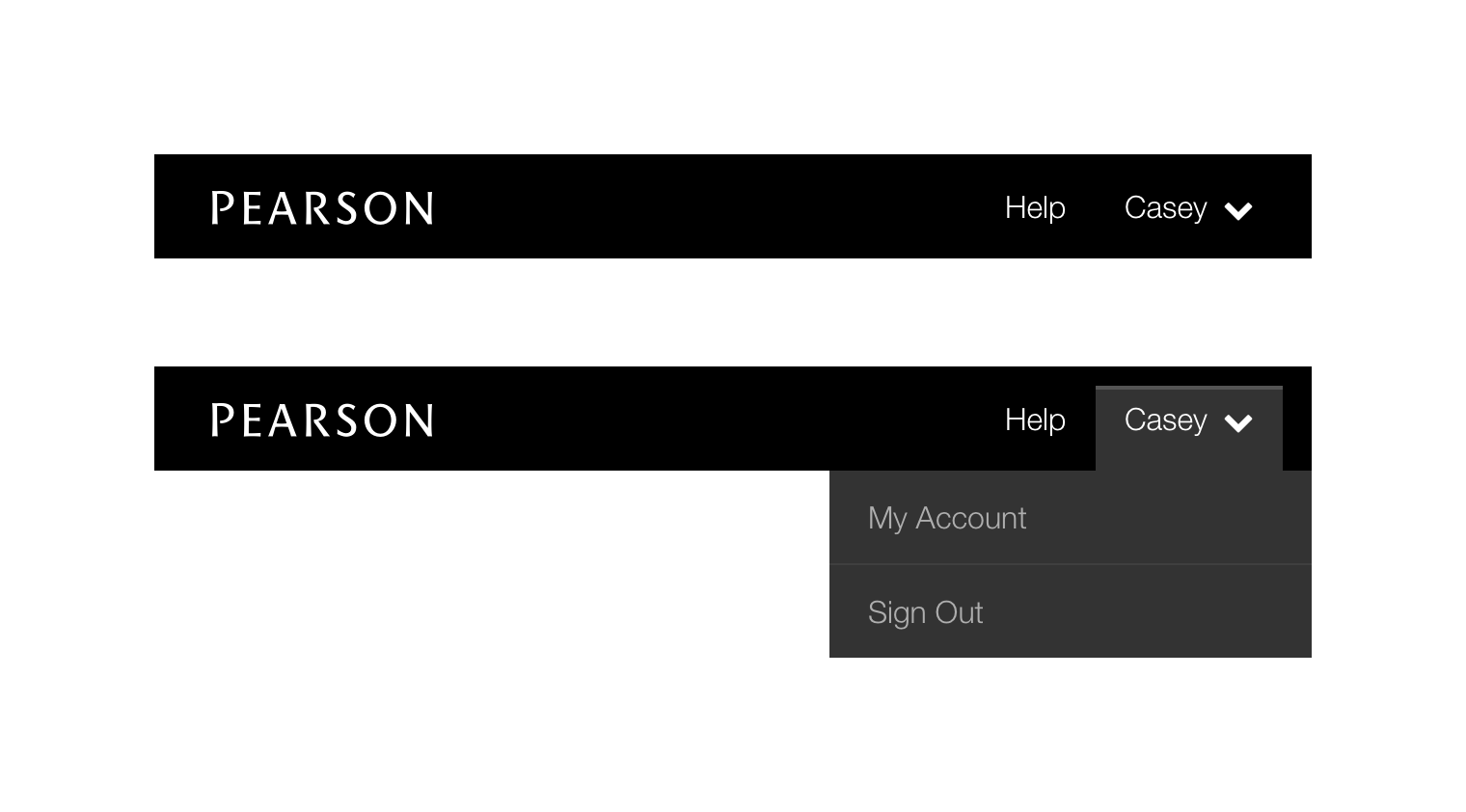
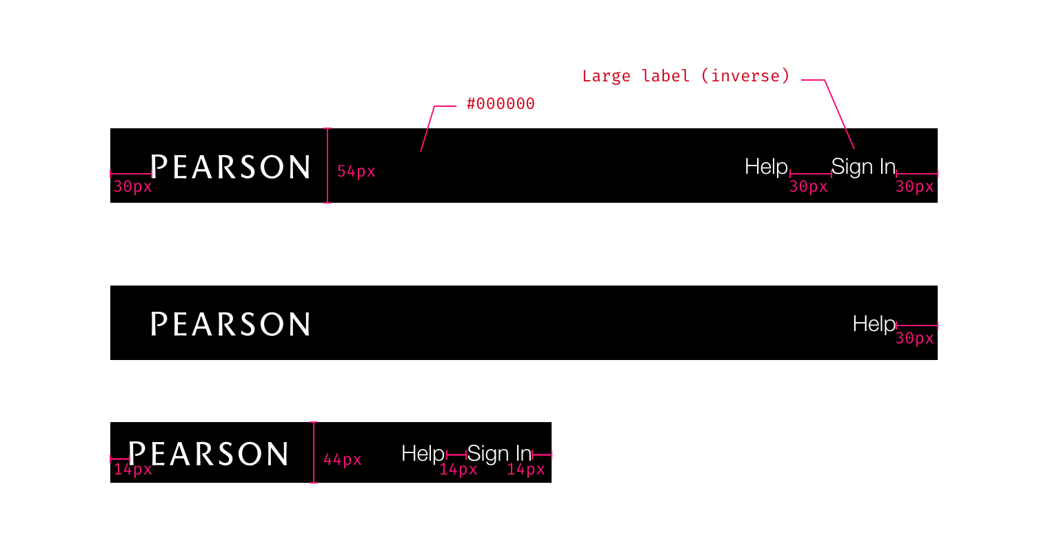
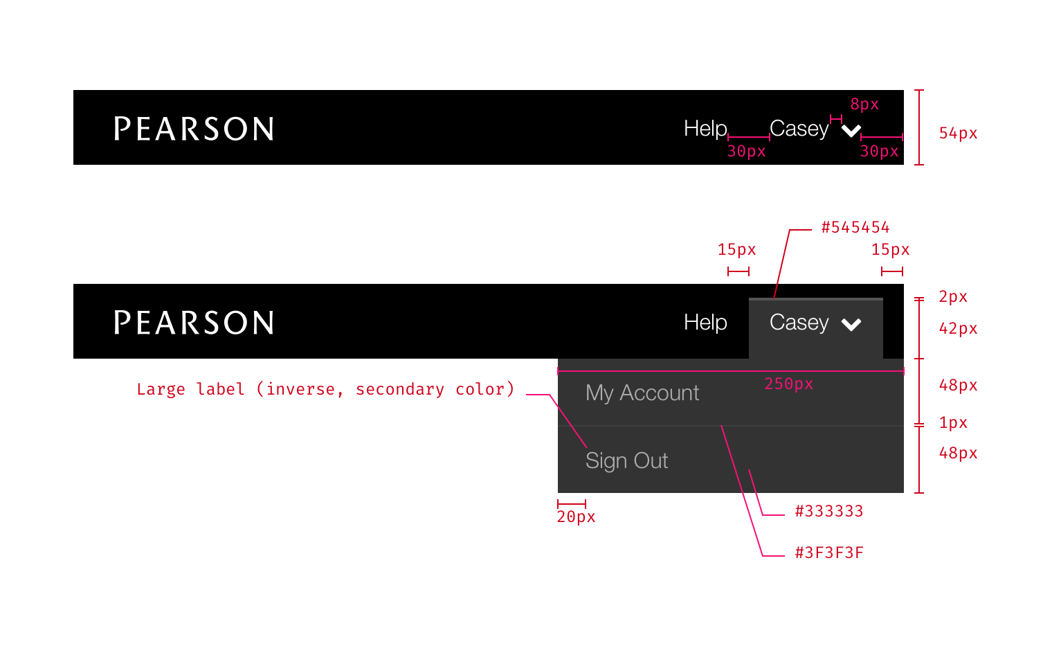
This is the simplest version of the header, just displaying the Pearson logo (with no link interaction), the help link, and (optionally) a Sign In link. The help link is designed to trigger the Contextual Help component.

Use this mode when the user is signed out.

Options

There is a single configuration option to remove the “Sign In” link. Use this option when displaying the sign in link in the header would be redundant (e.g. on the actual sign in page).

The signed out header has one style that works for every breakpoint. Shown with and without the sign in link.

Basic Mode

Represents the default signed in experience. Expands on the Signed Out Mode by making the Pearson Logo a home link (currently www.console.pearson.com) and including the User Menu.

The User Menu is labelled with the user’s first name and contains My Account and Sign Out options. At widths less than 768px it is condensed into the Mobile Menu which relabels the dropdown as “Menu” and extends it with a list of courses (if the consuming app has that information).

Use this mode when the user logs in to a standard Pi session and needs a default header experience.

Options

Course listing

The Mobile Menu can display a list of Next Gen courses for the current user. If the list is longer than five items in length it’s truncated and a “See X more courses” item is added at the bottom.

Use this when the consuming application contains a list of courses for the current user.

The desktop version of the basic mode header. (Note: Normally the mobile view would be used at this width, it has been compressed for illustration purposes.)

Mobile version with the course listing.

Course Mode

At desktop sizes this is identical to the Basic Header.

The Mobile Menu gains an “All Courses” link and any local navigation for the course.

The Course Mode also offers the ability to enable a light theme.

Use this mode when a user launches a specific product (such as Revel, Pearson Reader, etc.) with local navigation.

Options

Course navigation

At narrower breakpoints the Mobile Menu should contain the navigation for the course. The title of the current course will head this section. Use this option when the course offers any high level local navigation options.

Light theme

The header can switch it’s color from black to a light gray. This option should be used when the user is viewing a reading, assessment, or some other type of content which requires their complete focus.

Course mode with the light theme at < 480px; standard course mode at 480px – 767px.

Integration Mode

In this version of the header many options are removed that aren’t relevant in cases where a user is linking their account to a 3rd party (e.g. BlackBoard, Canvas, or other LMSs). The Logo is no longer a link and the right side of the header only contains a help link.

Use this mode when the user’s session is managed by a third party and the user shouldn’t have access to platform session features (e.g. sign out, My Account). Specifically, this applies to 3PL/LMS integration scenarios.

Integration mode

Redlines

Signed Out Mode

Available Styles Reference As (How do I use this?)
Signed Out Mode [](/design/c/application-header/v1.1.0/#rd-signed-out-mode)

≥ 768px (medium and larger viewports)

Logo link
  • No active link
Dimensions
  • 54px tall
  • 100% viewport width
Spacing
  • Logo and links vertically centered
  • 30px from either end
  • 30px between links
Background
Typography
States
  • Links use the browser default style for focus
  • Hovering shows the hand icon, but otherwise no style change

< 768px (Small and Extra Small viewports)

Dimensions
  • 44px tall
Spacing
  • 14px from either end
  • 14px between links

Basic Mode

Available Styles Reference As (How do I use this?)
Basic Mode [](/design/c/application-header/v1.1.0/#rd-basic-mode)

≥ 1024px (L and XL viewports)

Logo Link
  • www.console.pearson.com
Dimensions
  • 54px tall
  • 100% viewport width
  • Dropdown menu is 250px wide
  • Menu items are 48px tall
  • Menu dividers are 1px
  • Dropdown tab is 42px tall
  • Cap over tab is 2px tall
Spacing
  • Logo and links vertically centered
  • 30px from either end
  • 30px between links
  • 8px between username and chevron-down icon
  • Dropdown tab has 15px of horizontal padding
Colors
Typography
States
  • Link focus states use the default browser implementation
  • Hovering an item in the dropdown menu will show an underline

768px – 1023px (Medium Viewport)

Username is truncated to no more than 20 characters

Redlines for larger viewports

480px – 767px (Small Viewport)

Dimensions
  • 44px tall
  • 100% viewport width
  • Dropdown menu is 250px wide
  • Course items in menu are 60px tall
  • Other menu items are 48px tall
  • Divider lines are 1px tall
  • Dropdown tab is 36px tall
  • Cap over tab is 2px tall
Spacing
  • Logo and links vertically centered
  • 14px from either end
  • 28px between links
  • 8px between link and icons
  • Dropdown tab has 14px of horizontal padding
Colors
  • Same as larger viewports
Typography
Course List
  • If more than 5 items, add a ‘Show X more courses…’ item at the bottom

< 480px (Extra Small viewport)

Dropdown menu becomes 100% wide

Redlines for smaller viewports.

The ‘Show X more courses…’ item.

Course Mode

Available Styles Reference As (How do I use this?)
Course mode [](/design/c/application-header/v1.1.0/#rd-course-mode)

≥ 768px (Medium and larger viewports)

Follow the Basic Mode specifications.

480px – 767px (Small viewport)

At this size the course navigation appears in the dropdown.

Logo Link
  • www.pearson.console.com
Dimensions
  • All courses link is 48px high
  • Local nav options are 44px tall (incl. header)
Spacing
  • Top level links, and heading, have 20px horizontal padding
  • Local nav options have 30px left padding, 20px on the right
  • Heading has 9px top padding
  • All Courses has 8px padding for the icon
Colors
Typography
States
  • Follow the Basic Mode specifications

< 480px (Extra Small viewport)

Same as above, dropdown just becomes 100% wide.

Light theme

Colors
Typography

Integration Mode

Identical to signed out mode, without the ‘Sign In’ link.

Available Styles Reference As (How do I use this?)
Integration Mode [](/design/c/application-header/v1.1.0/#rd-integration-mode)

Changelog

1.1.0

  • CHANGED: Use colors component
  • CHANGED: Use typography component
  • ADDED: Details on local nav item truncation
  • ADDED: Details on focus and hover states
  • ADDED: .ai mockup file
  • ADDED: Dependency list and references
  • ADDED: Exported styles

1.0.0

Initial release