Tables
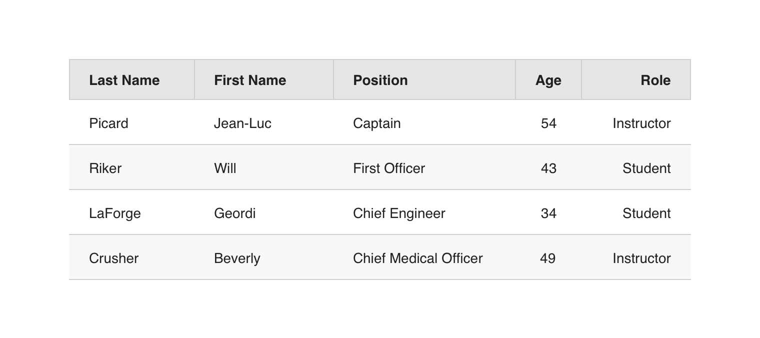
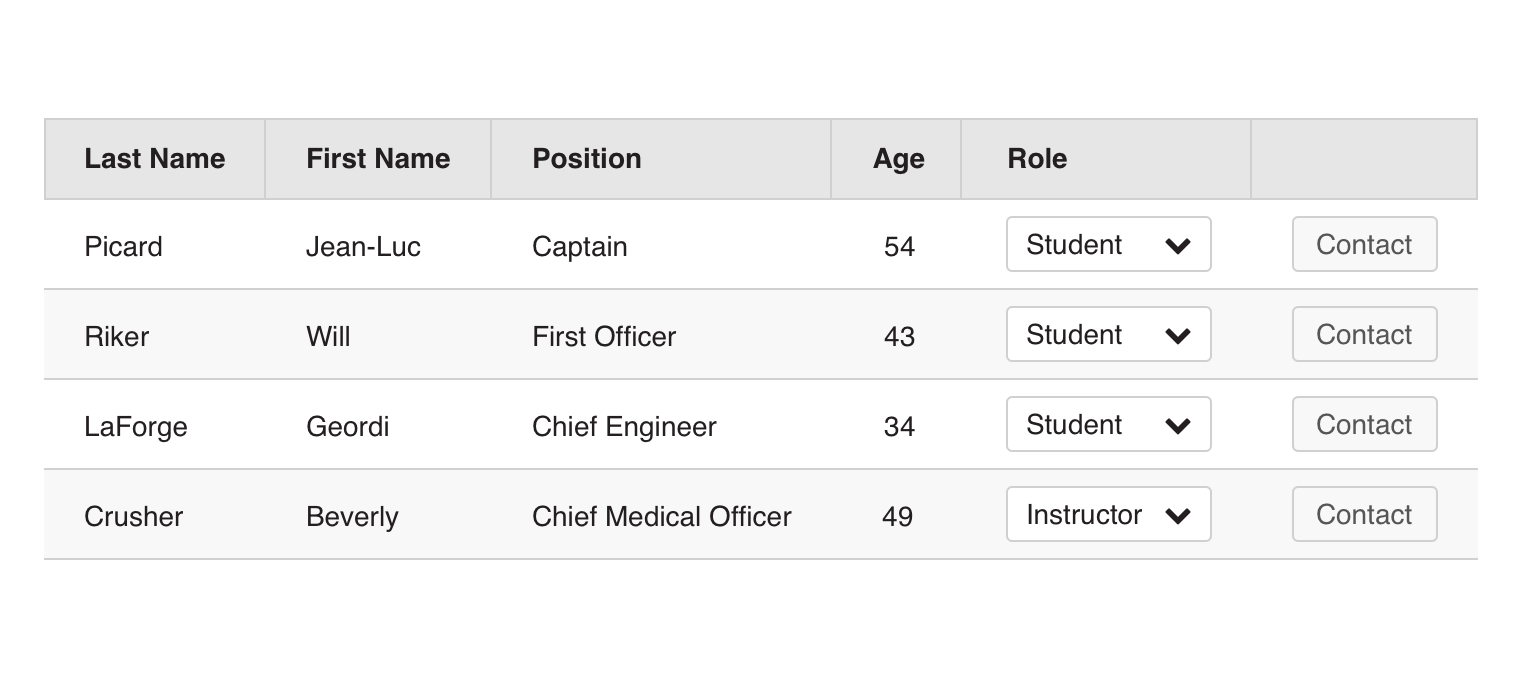
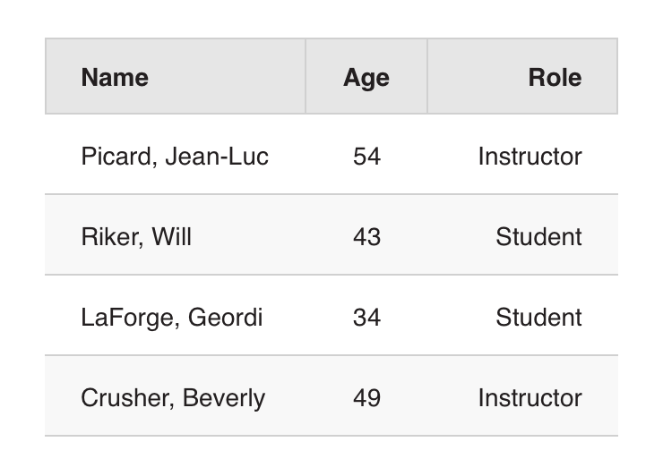
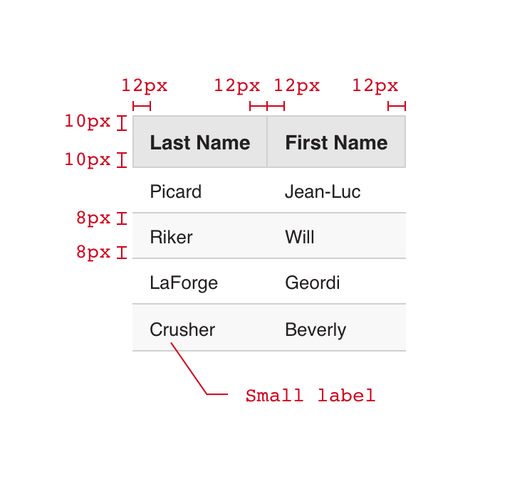
The basic table does what you would expect, presenting data in a static tabular format with headers.
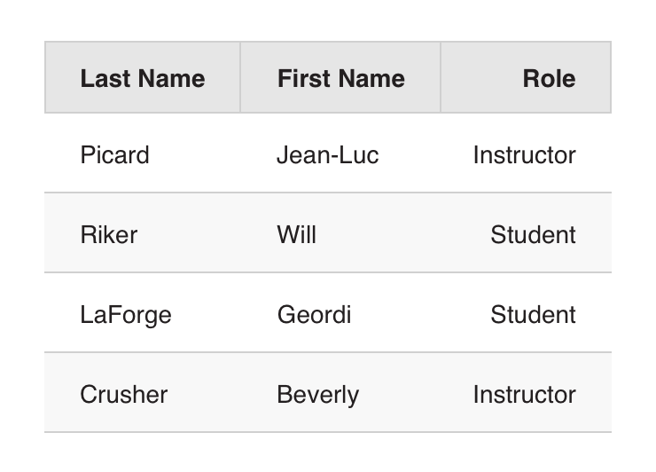
Columns can be left, center, or right aligned.
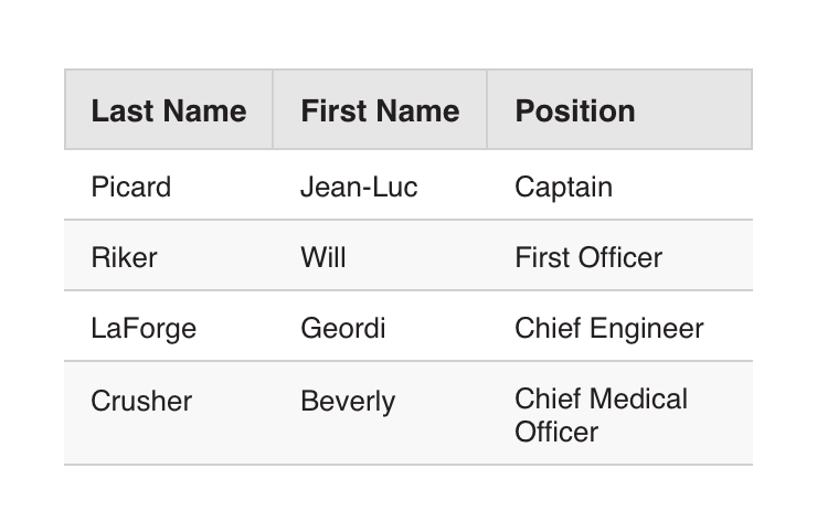
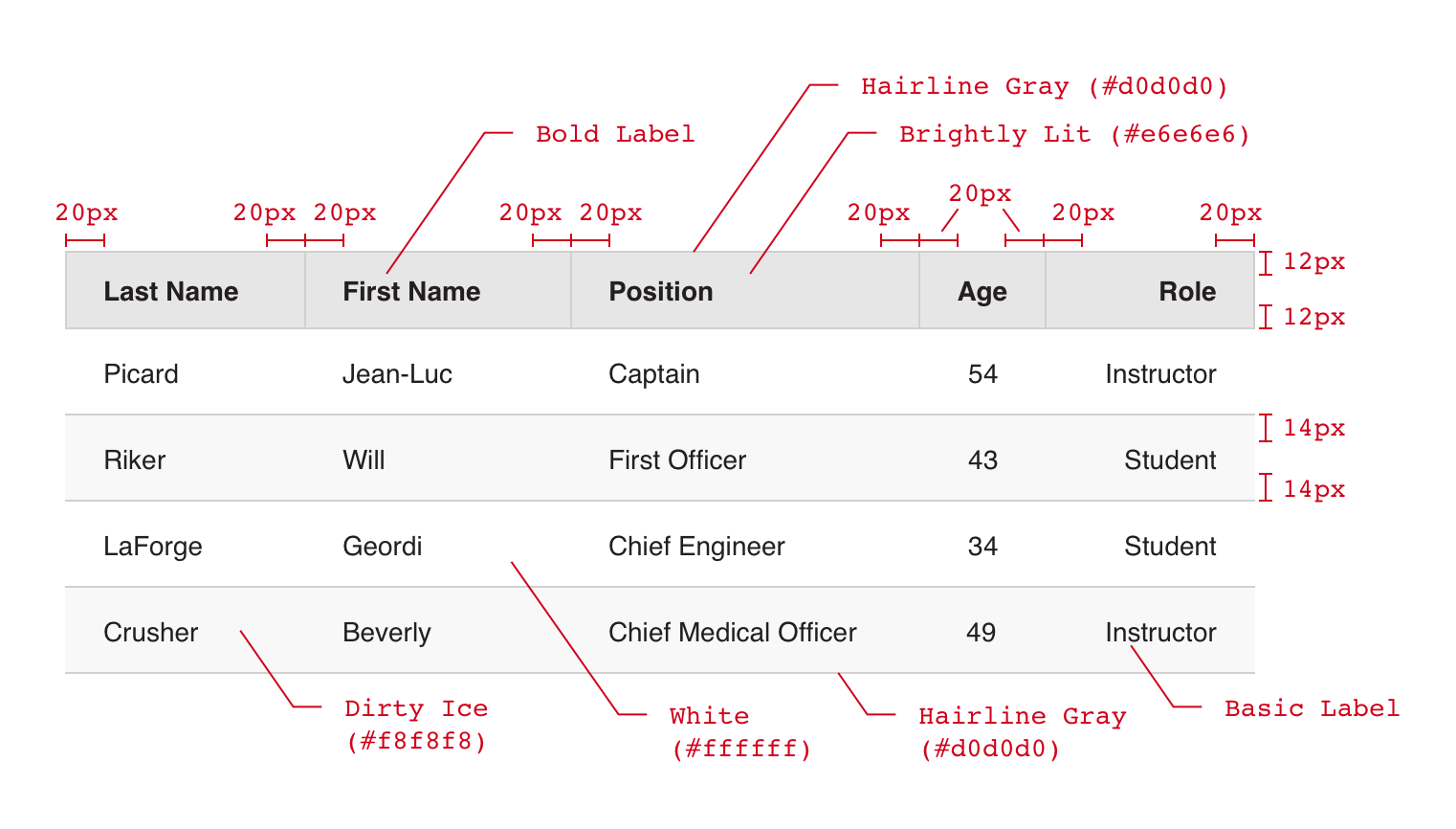
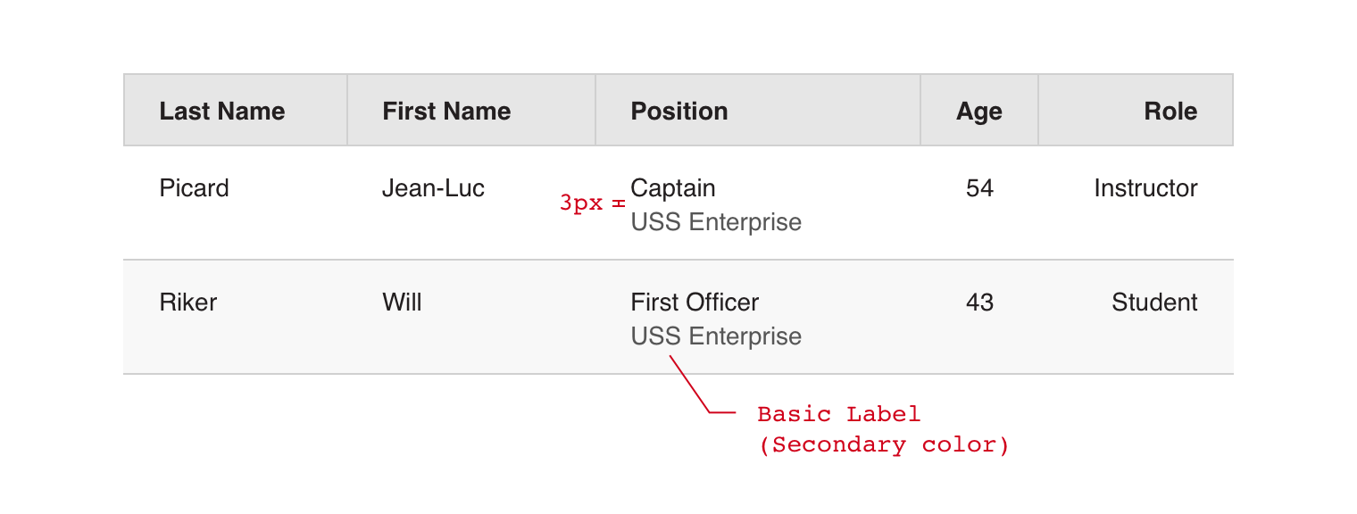
Multiline cell content should be avoided where possible, but is allowed if necessary. Content should be top aligned.
Note that headers are required for accessibility compliance.